An Iconic Game Environment Realised as a Cinematic Movie Trailer
PIXL VISN media arts academy student Raphael Stiep shares details of his midterm project, resembling a cinematic trailer establishing shot.
PIXL VISN media arts academy student Raphael Stiep shares details of his midterm project, resembling a cinematic trailer establishing shot.

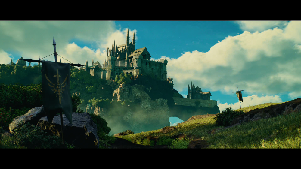
PIXL VISN | media arts academy student, Raphael Stiep, created a realistic depiction of Hyrule’s Castle from The Legend of Zelda: Breath of the Wild, presented in the style of a cinematic movie trailer establishing shot, for his midterm project. In this article Raphael shares his creative process and learnings along the way.
It's a great honour to be invited by The Rookies to share one of my latest creative projects, and the creation process with you.
This was my first Midterm here at PIXL VISN | media arts academy where I had to make an art piece out of a given theme, and also the first time I was allowed to focus on a more specific part of the production pipeline. Mid/End Terms are intense 1 week training projects.
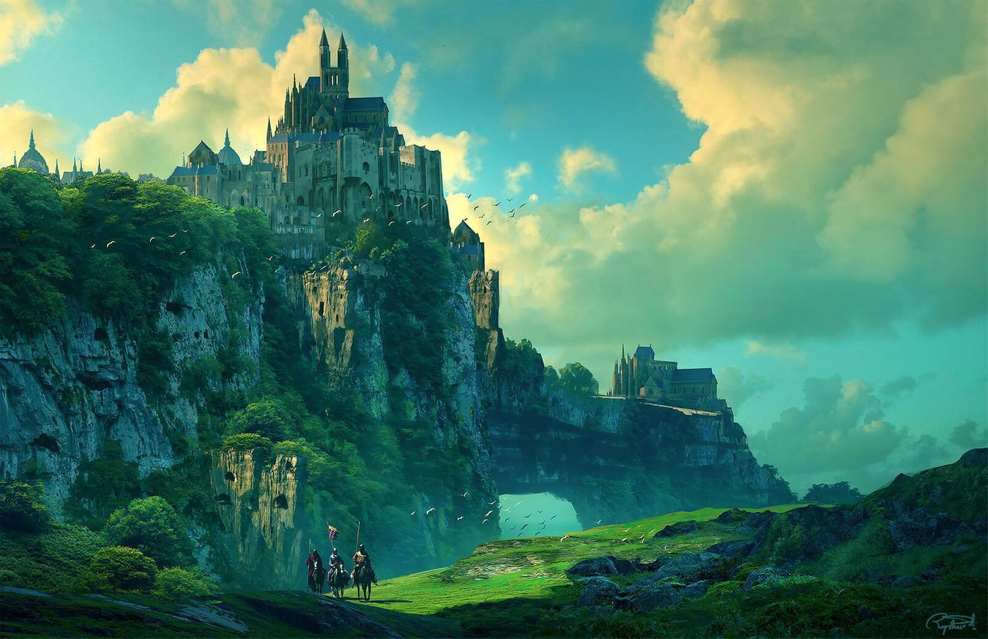
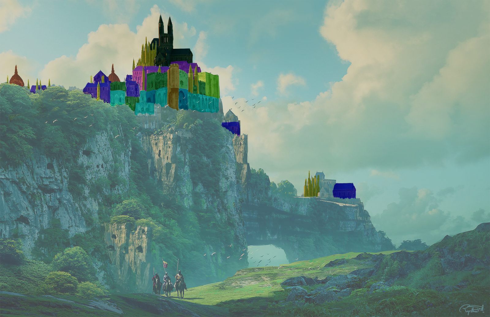
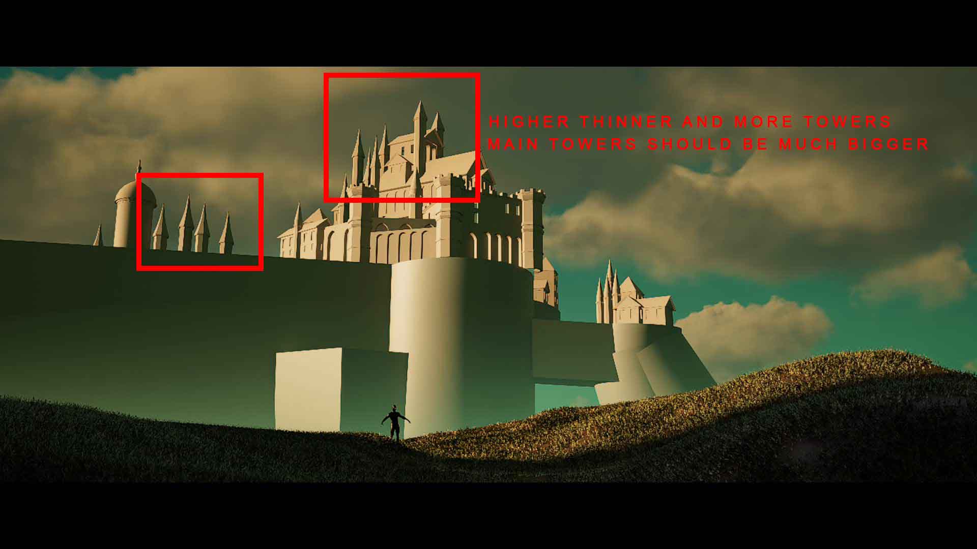
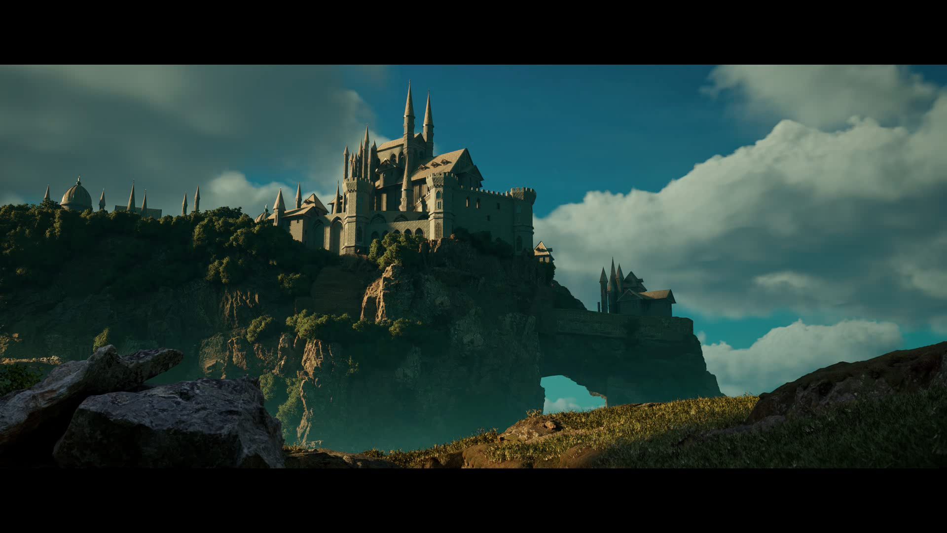
The assigned theme, "Nintendo," initially challenged me as I wasn't familiar with much of their content. However, after delving into research on The Legend of Zelda, a franchise I hadn't explored before, I was inspired by a captivating concept art of Hyrule’s Castle by Raphael Lacoste. Here, I proudly unveil my rendition of Hyrule’s Castle.
We were presented with four diverse projects, each emphasising distinct aspects of the Pipeline. I opted for the "Environment with built structure" project, tasked with creating an environment that is either entirely CG or a blend of CG and compositing. While permitted to use various assets, I was responsible for modeling and texturing the built structure myself. Within a week, I aimed to produce a minimum of 5 seconds of rendered footage, excluding titles and breakdowns.
From my own experience and every teacher / tutorial telling me a thousand times it is pretty clear: REFERENCES ARE EVERYTHING!
So, I started to gather all the reference material I thought necessary, creating a mood board and analysing Raphael Lacoste's concept art to understand the composition and his idea behind it. When searching for references, I typically browse websites like ArtStation and Google to find what I need. Recently, I've started using Miro instead of PureRef to compile all my references, and I've been quite satisfied with it thus far. One benefit I've noticed is that it also enables me to add videos to my collection and even share the board with instructors or other students for collaborative work.
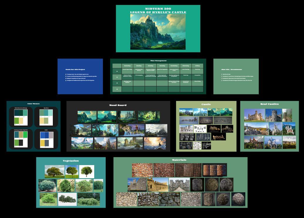
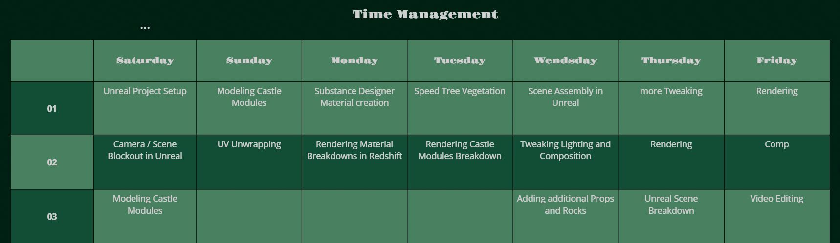
The last step of my preparation is always to create a Time-Management plan so that I know what to do roughly on each day:
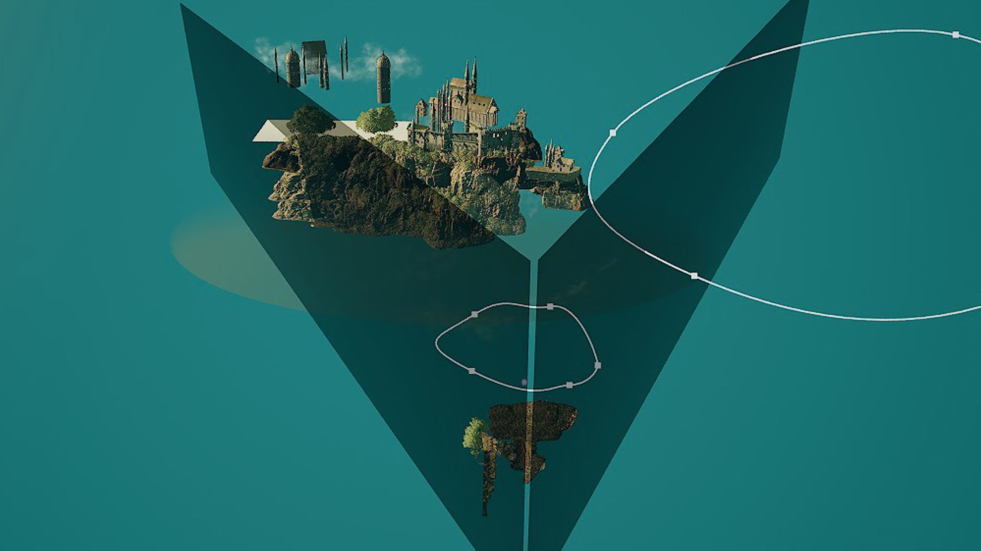
An important distinction between environments for Film and Games is that in Film, you almost always have a fixed camera angle. While this may seem obvious, considering it early on can save the artist a significant amount of time. This is because unnecessary elements that won't be visible to the viewer don't need to be built, and detail can be managed based on the distance between objects and the camera. To address this, I incorporated invisible barriers into the scene that spanned the entire world. These barriers provided a clear indication, throughout the project, of what would be visible in the final shot—a huge time saver!
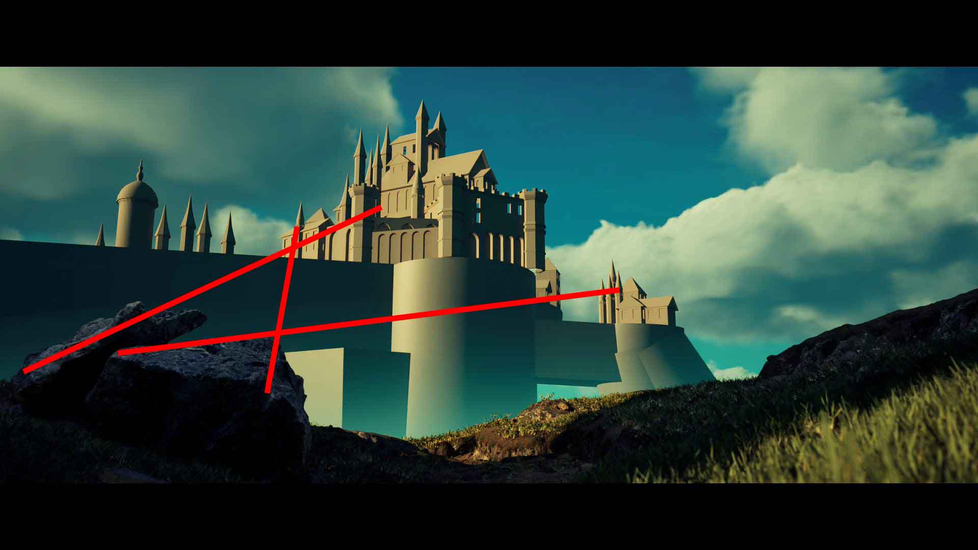
With that in mind, I began working on my first goal, which was to create an immersive composition for the shot. Since much of the concept art provided a foundation, most of the effort went into refining the camera movement and adjusting scale. Given that the Mid Ground in this shot comprised mainly a large valley, it was crucial to establish depth between the foreground and background. However, achieving this proved to be a major challenge, requiring extensive adjustments. Ultimately, the key components that contributed to the success of the composition included: a camera movement with significant parallax effect (foreground and background appearing to move at different speeds), extending the foreground to enhance depth perception, and incorporating various dynamic elements such as smoke and birds to evoke the atmosphere of the valley. After positioning a few cubes and adding some foreground terrain, this became the initial version:
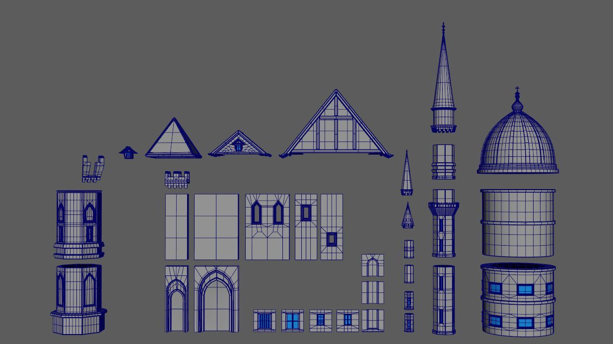
As I was aiming to create a fully modular castle set, (which should also save me a lot of time modeling and texturing a huge amount of assets), I first started by colour coding the original Reference to get an idea of which pieces I had to model, and how they should fit together.
After that I brought my basic shapes from Unreal Engine into Maya and rushed into the modeling process which in of itself went quite well. Knowing that this asset will be in the background I held back quite a bit on the details I put into it and tried to keep the poly count rather low.
When it was time for UV mapping and texturing, I encountered my lack of experience in this area. The objective was to minimise the use of textures and avoid the conventional approach of texturing each module separately, as I had done previously. I aimed to create two trim sheet textures for the Castle and apply them to all the modules I had created. However, during this project, I learned that texturing and modeling any asset should be done simultaneously to achieve optimal results, particularly when using trim sheets.
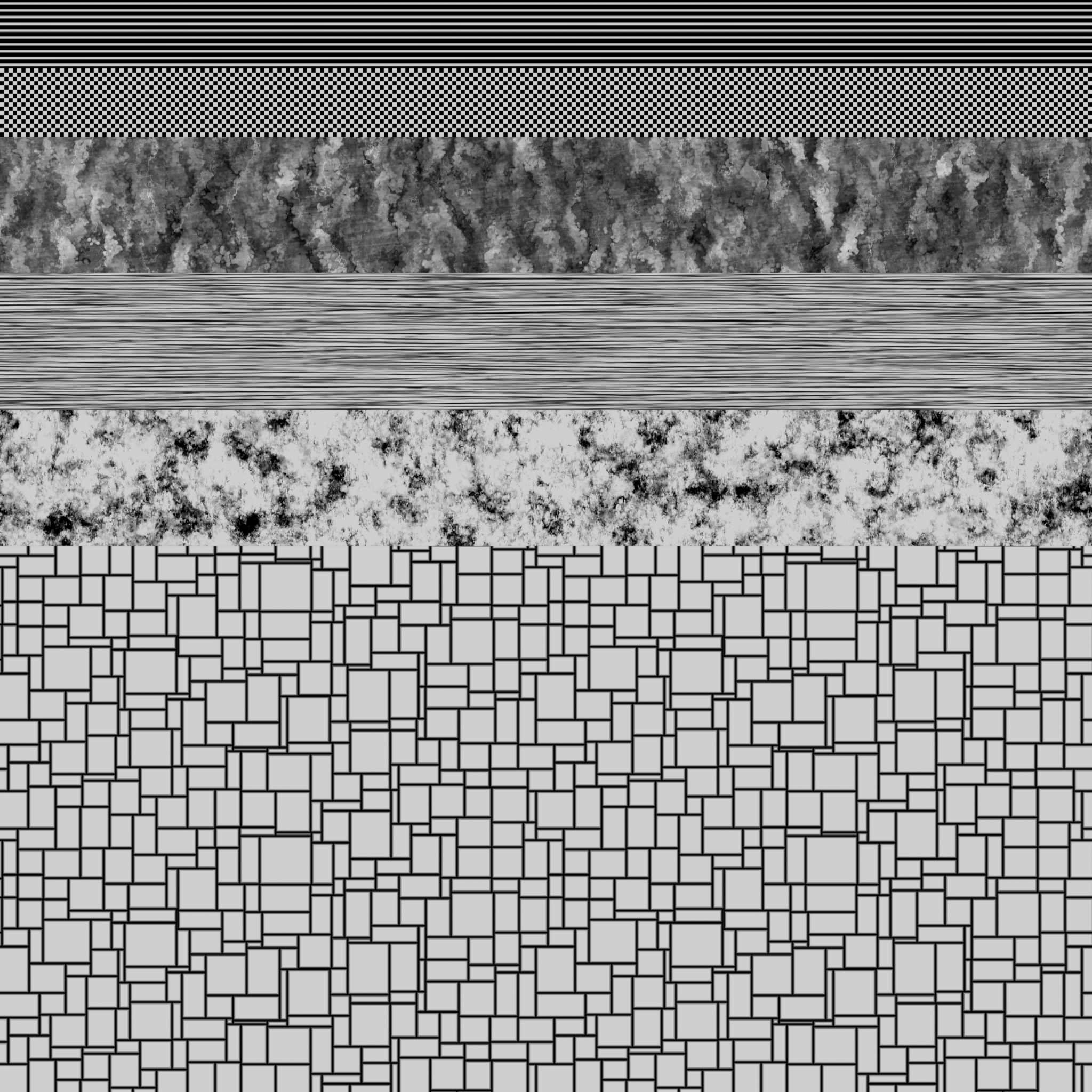
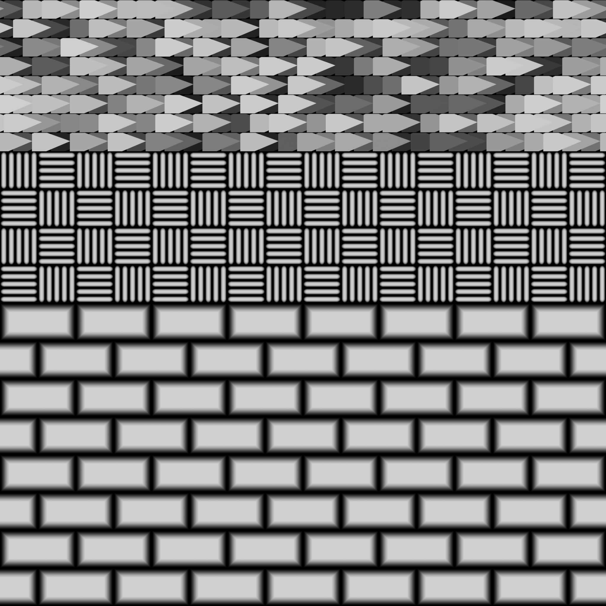
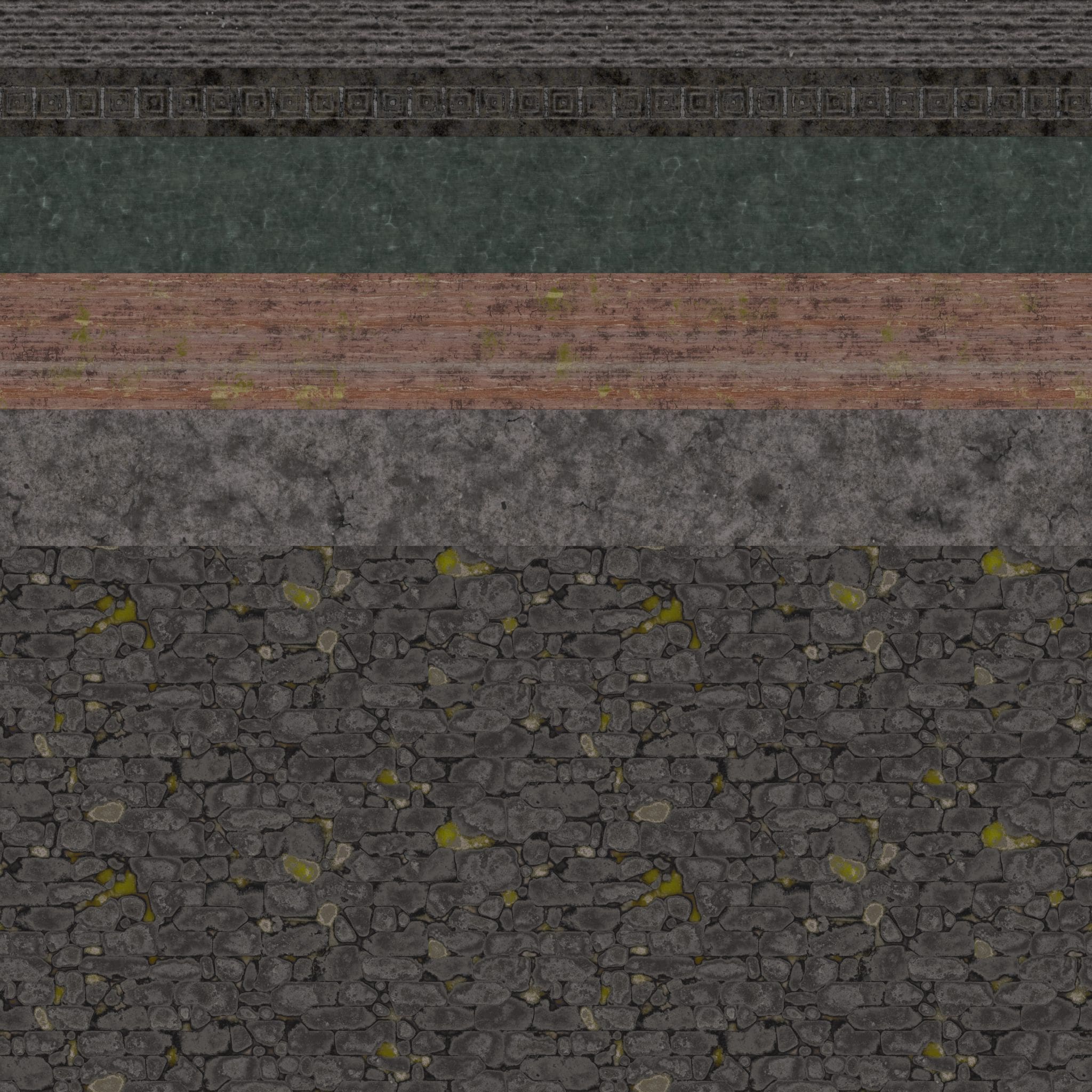
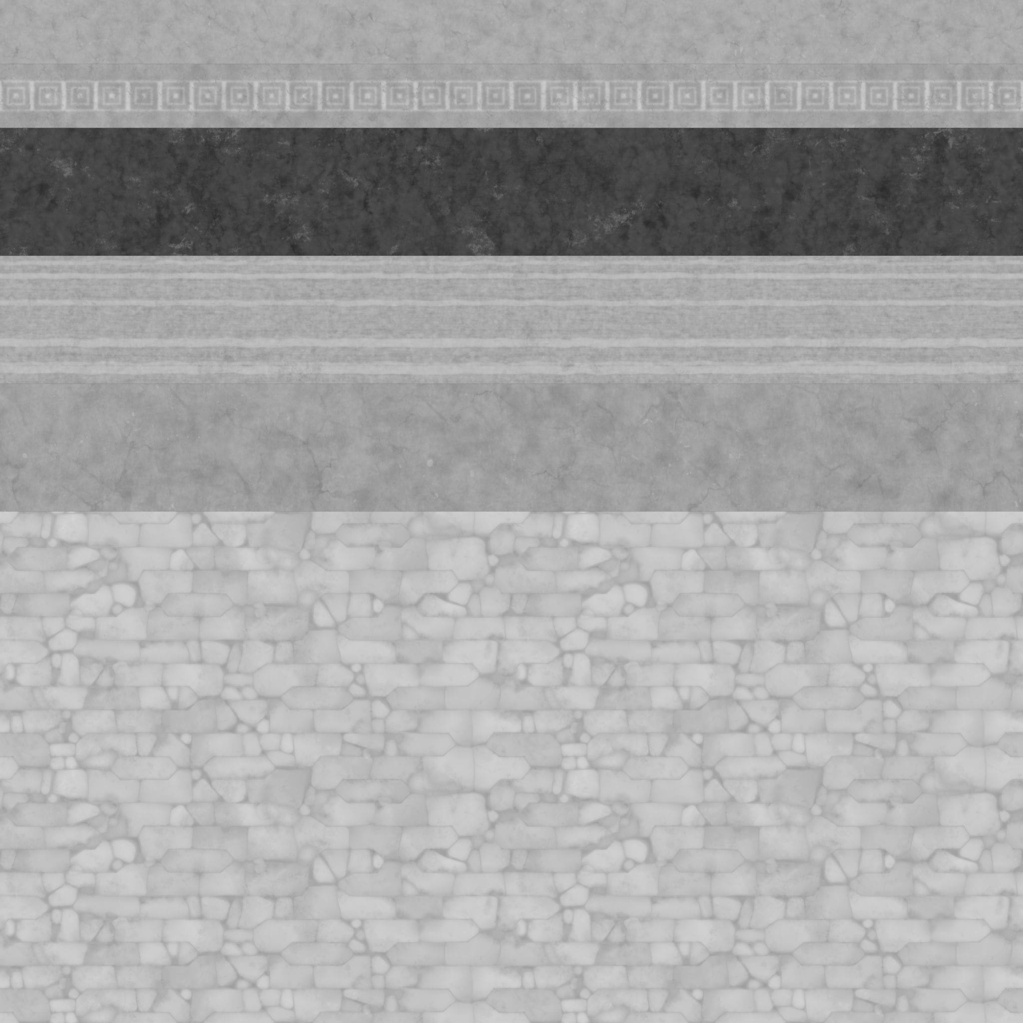
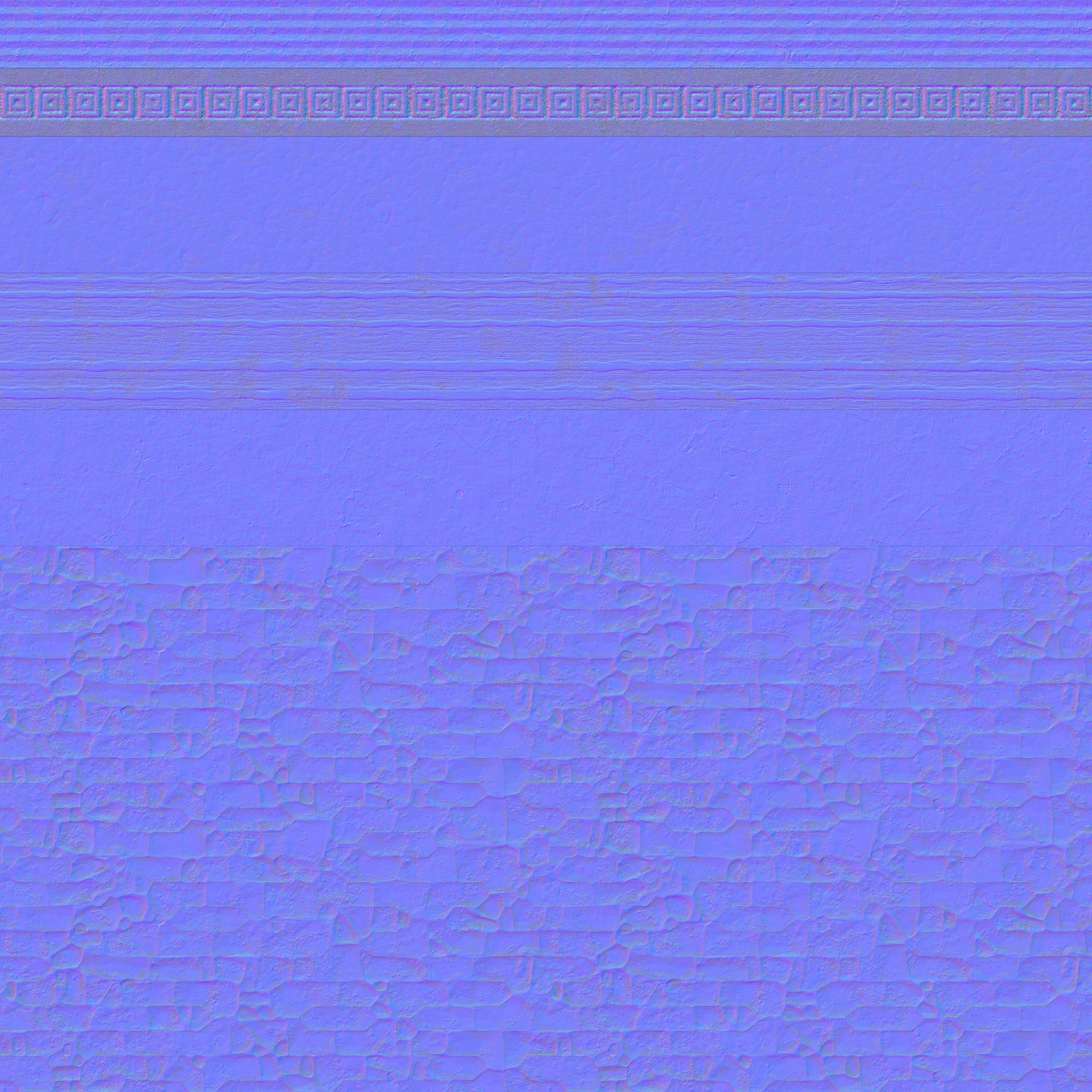
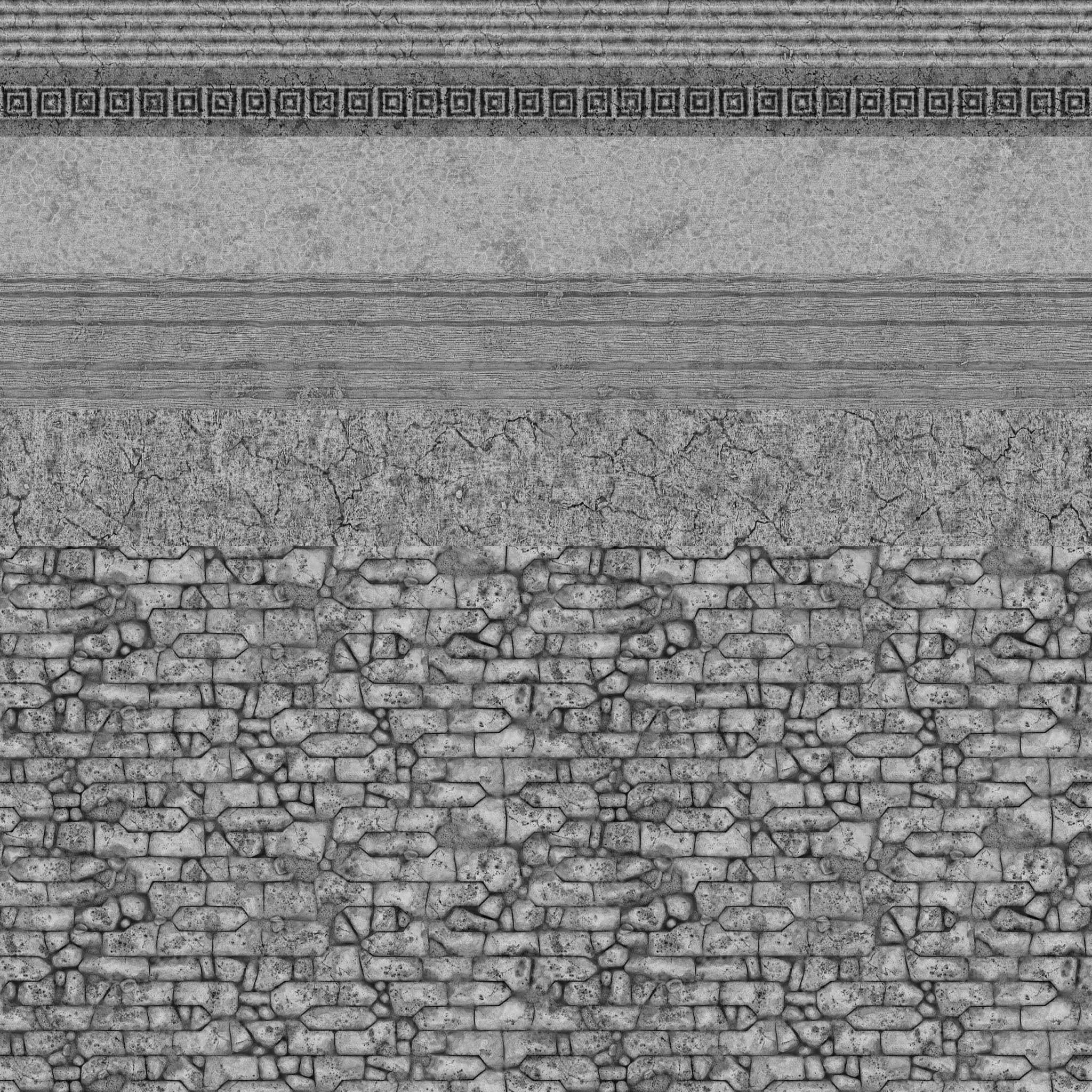
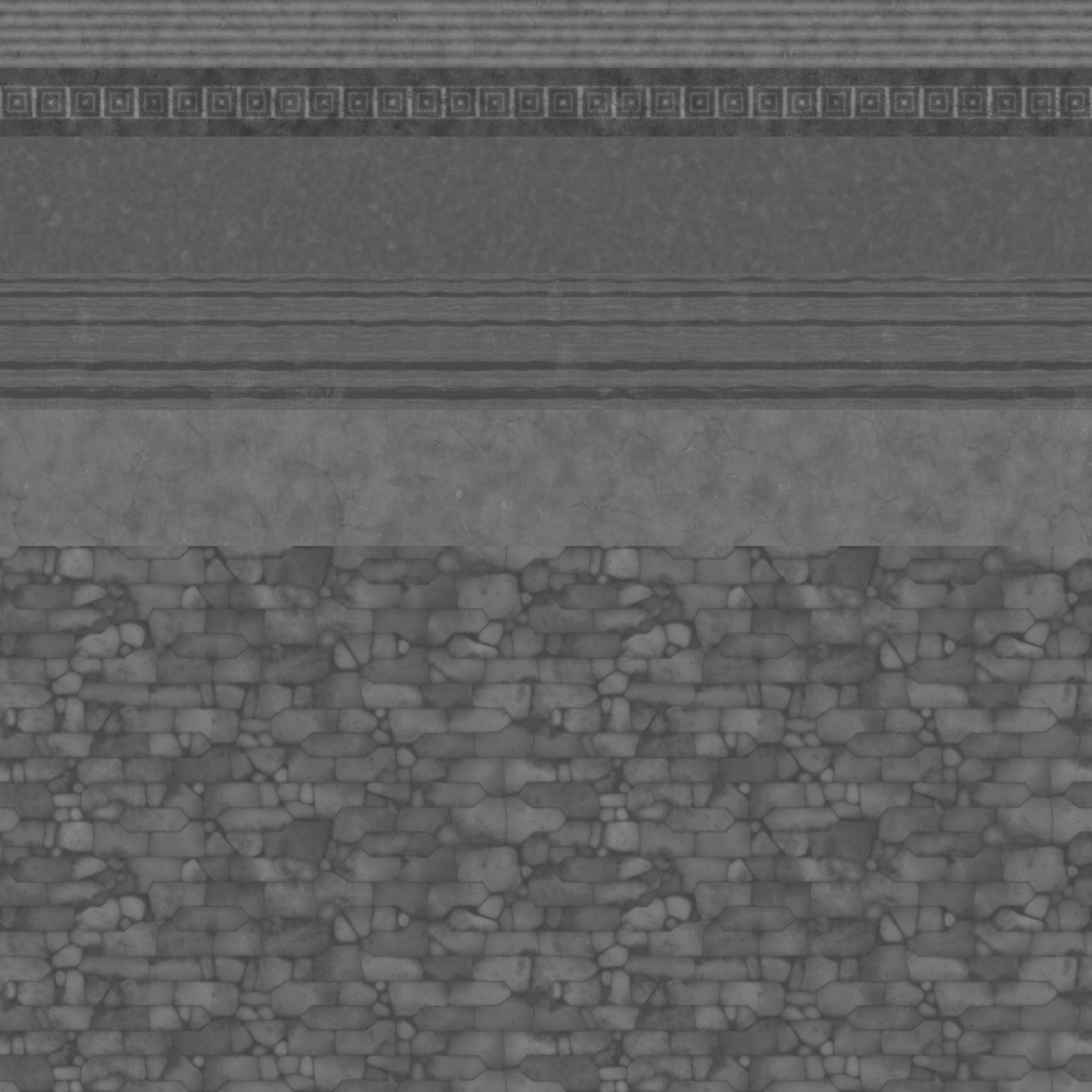
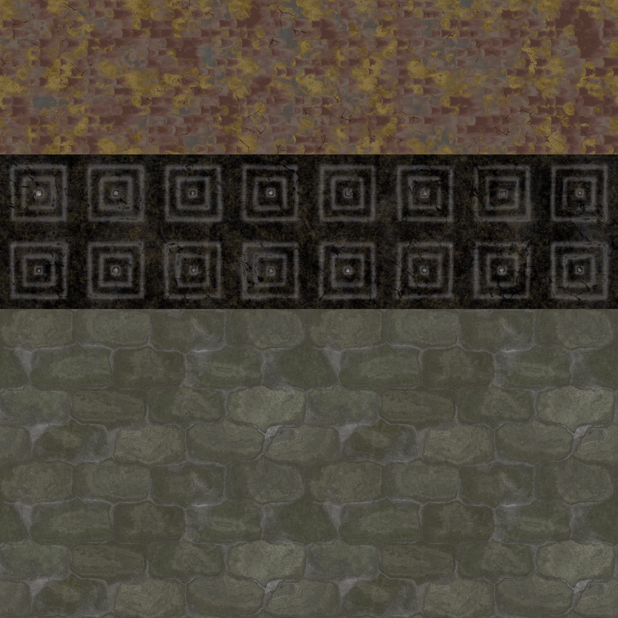
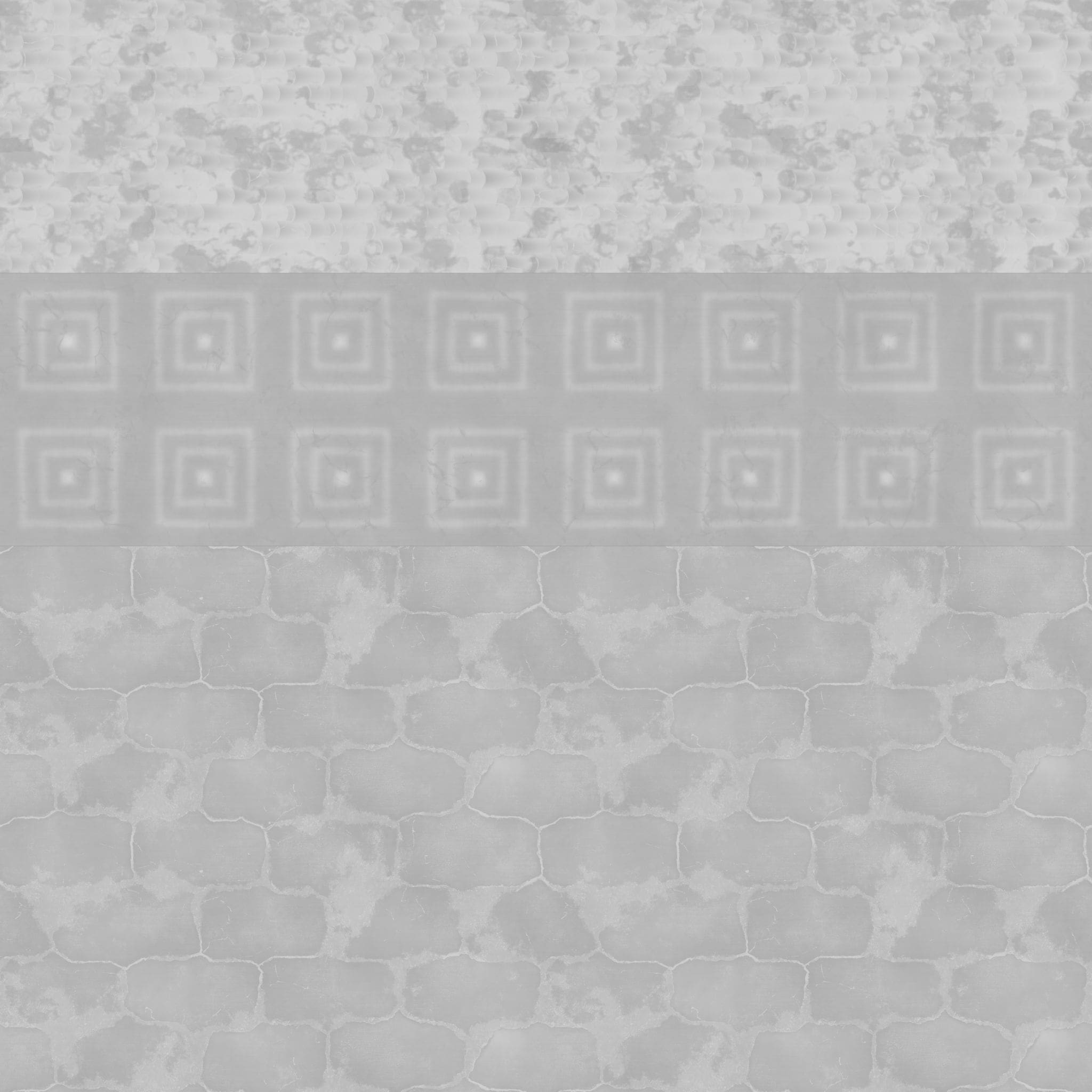
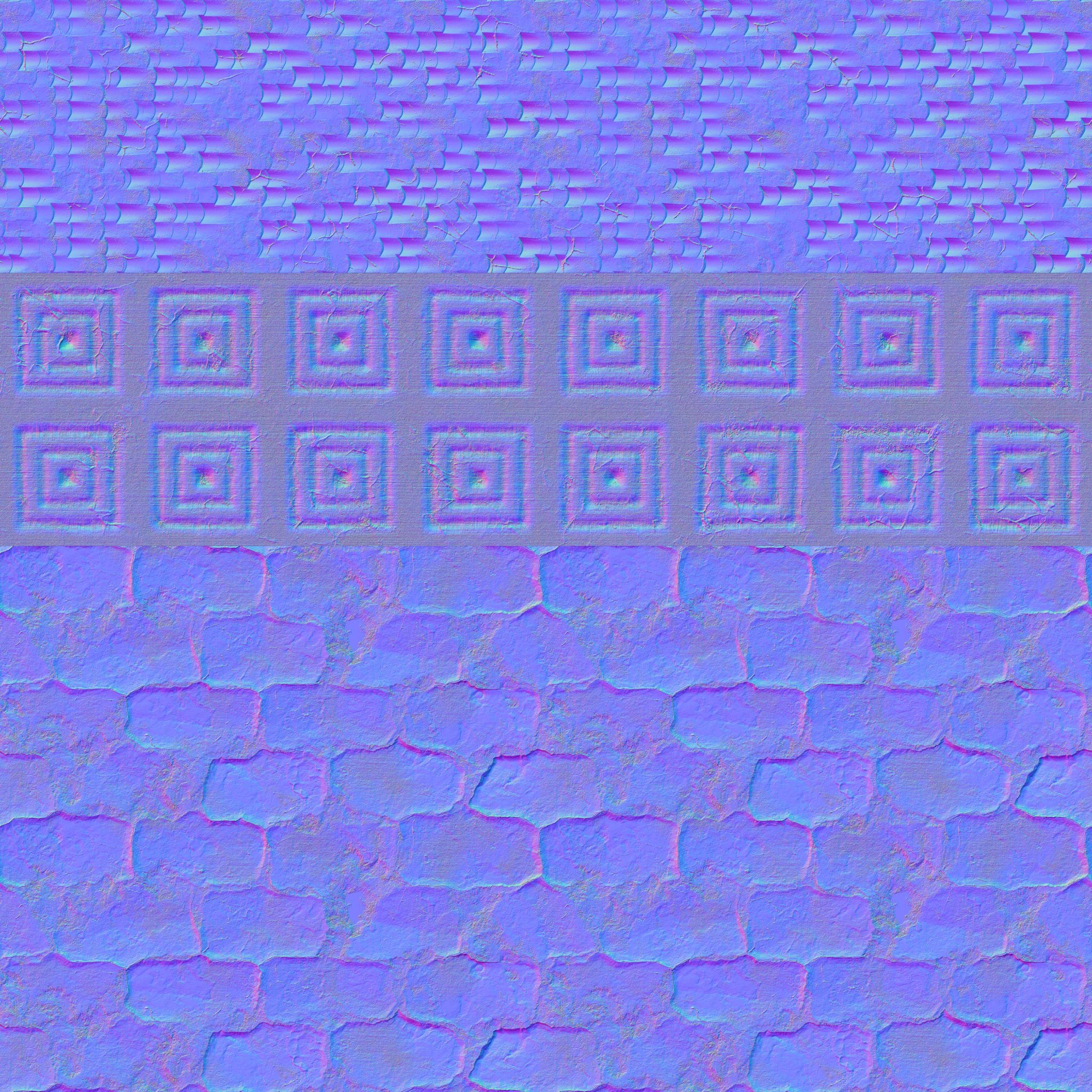
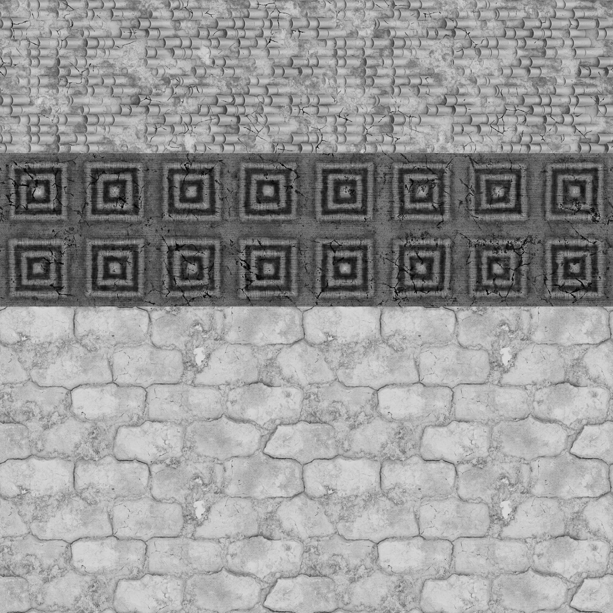
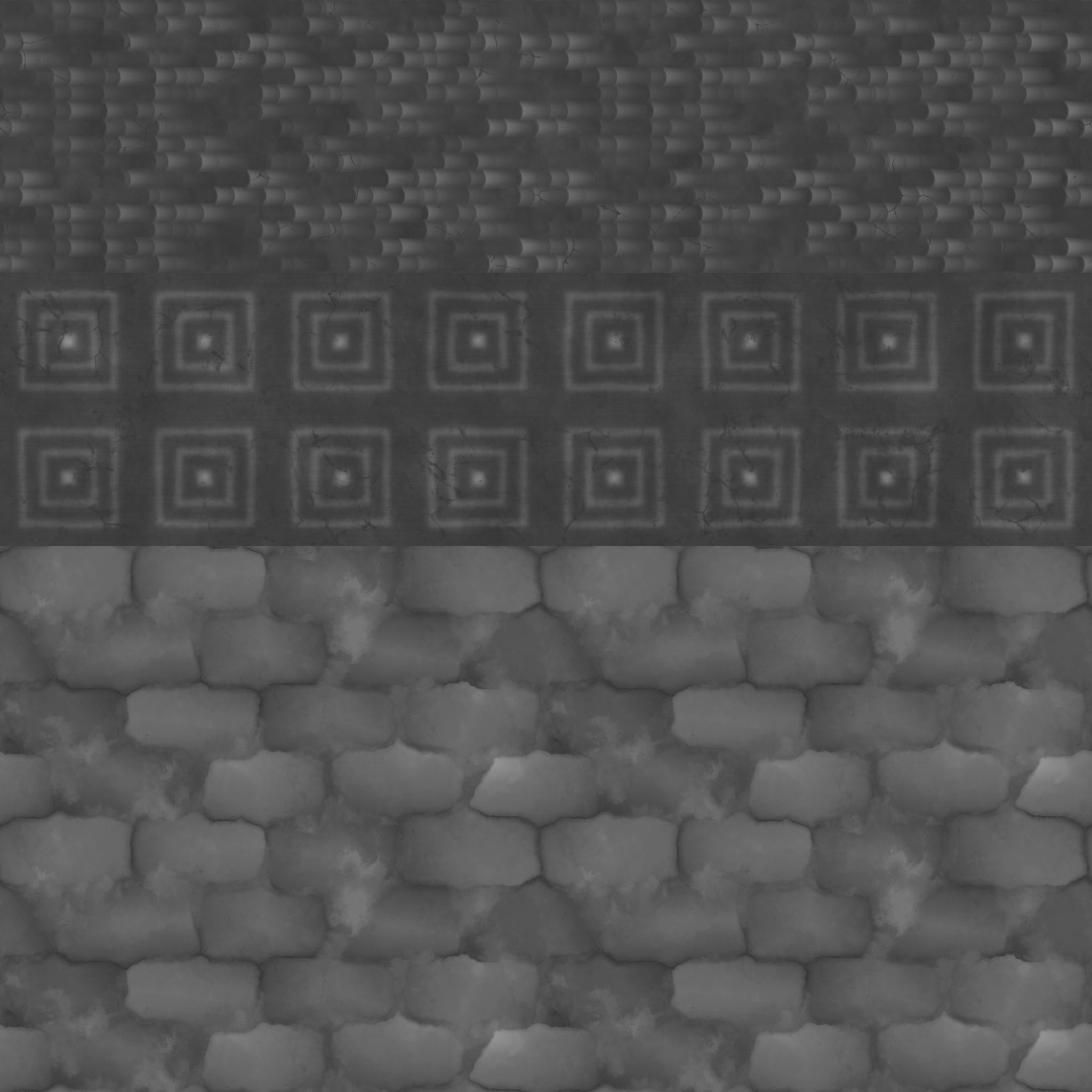
Realising this, I began creating trim sheets in Substance 3D Designer for the modules I had modeled in Maya. This involved a iterative process of designing a repeating pattern in Designer, exporting the maps to Maya, and arranging the UV mapping based on those maps. I used basic noises and generators during this testing phase to ensure that the tiling on the modules would function correctly.
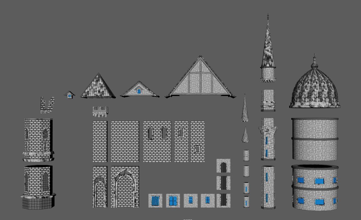
I faced an issue with the brick walls of the castle when the usual horizontal tiling of a trim sheet wasn't sufficient to achieve the desired brick size and detail. To address this, I opted to utilise a node called 'Non-Square Transform.' This node enabled me to merge different non-square textures, which tiled in both the U and V axes, into a single square texture while preserving the tiling of each patch in both axes. You can find the tutorial for this technique here.
In retrospect, I realise that this decision was somewhat misguided. For certain parts of the asset, I should have used regular square tiling textures, as there was no advantage to fitting them into a trim sheet if they were meant to tile in both the U and V axes anyway. (However, it proved to be a valuable and intensive learning experience.) Once the technical task of assigning all the various trim parts from the textures to my model was completed, I started to create the different materials in Substance 3D Designer.


Going back to Unreal Engine, let's look into the world-building aspect of my project. Once I had completed the base model for the castle, I did the initial test of importing the asset into Unreal Engine and creating a layout to ensure everything was functioning properly. It was at this point that I made a few final tweaks to the modeling before starting the texturing phase described earlier.
The next step was to focus on the foreground terrain. After creating the blockout using the Unreal Landscape tools and sculpting it to the desired shape, I incorporated various ground assets and plants from the Quixel Megascans Library to populate the foreground landscape. I also opted to include a large boulder rock formation in the foreground, directing attention towards the castle and enhancing the composition by providing a guiding line towards it.
After that I added the final castle modules to my Unreal project and matched the layout I already had in the scene.
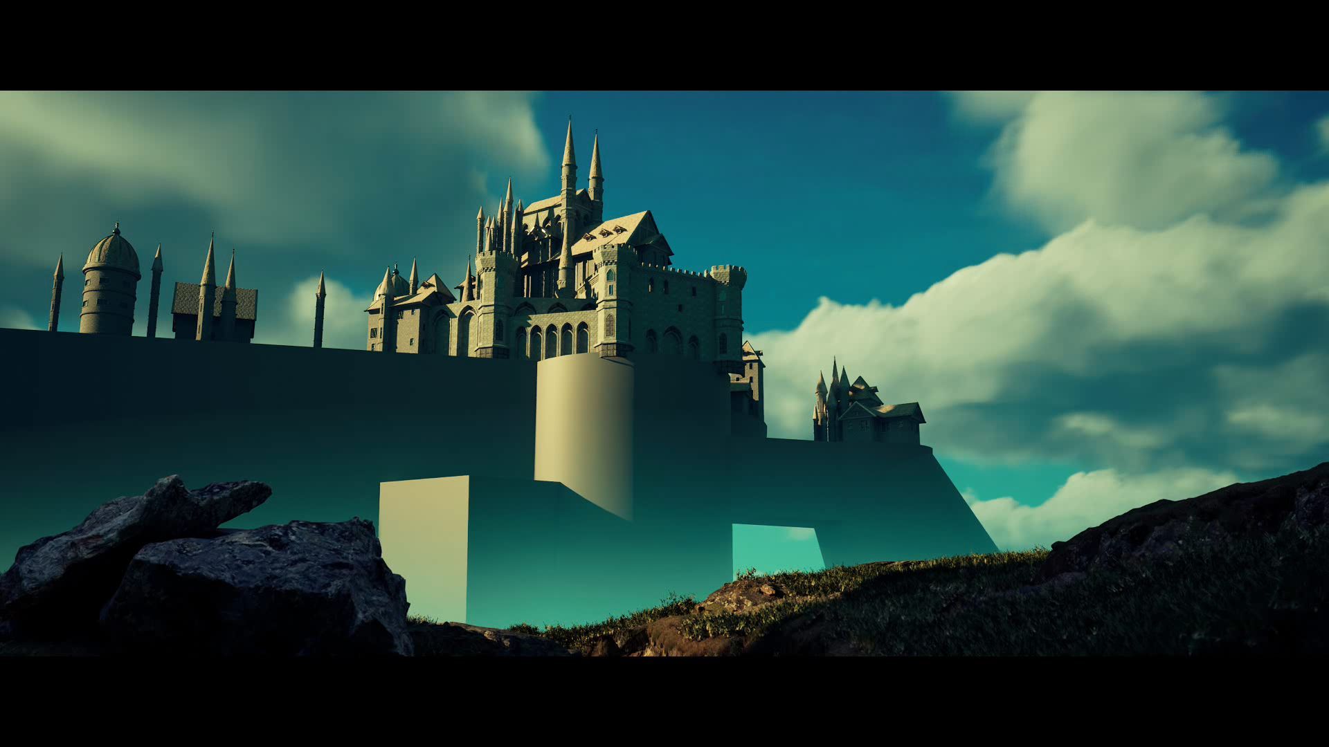
This was when I was really starting to have a lot of fun with this project. Next I added the cliffs in the background using Quixel Assets, and also worked quite a bit on the lighting and atmosphere in the scene. I played around with the sky and cloud movement, as well as added some local height fog to increase the foggy fade coming up from the valley.
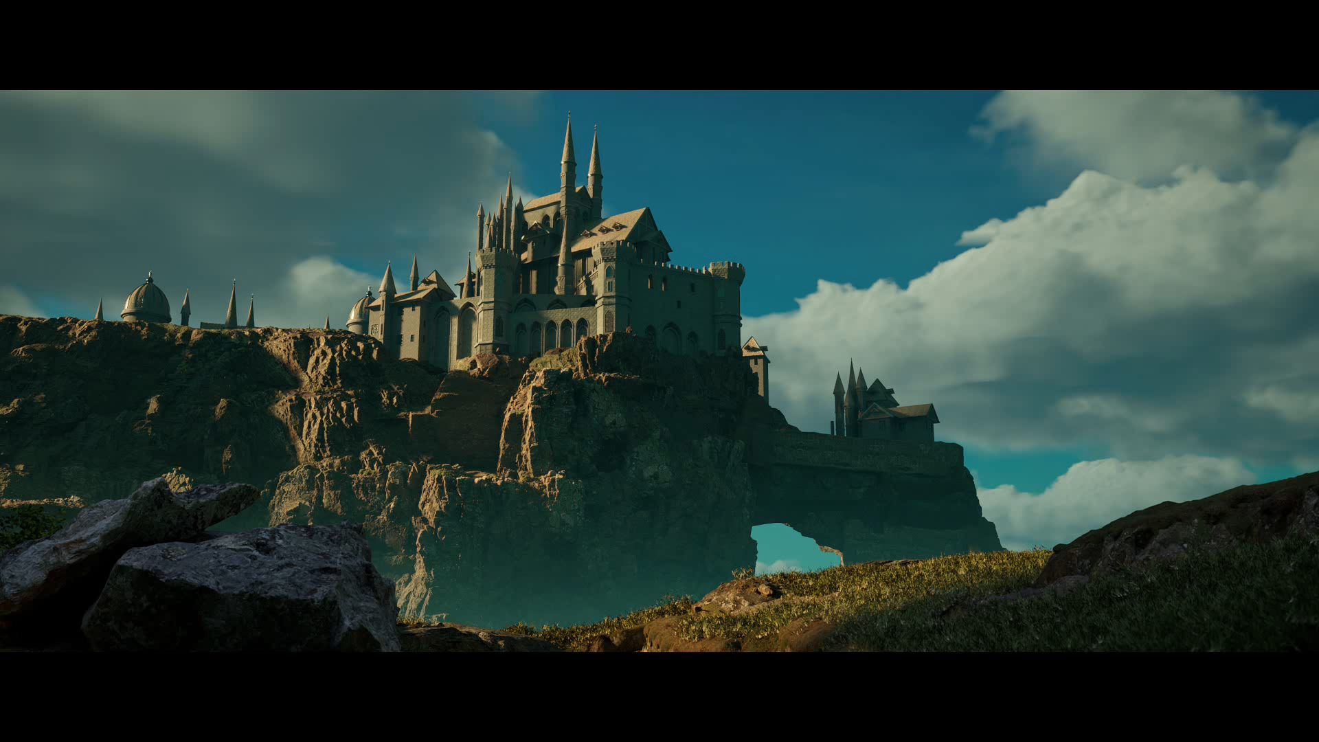
I really love these round full bushes and trees that were growing all over the cliffs in the reference. My original plan was to use Speedtree to custom create them and match them as closely as possible. Sadly, due to time constraints I had to scrap this plan and decided to get a really nice, kind of matching, bush kit from the Epic Marketplace. I then used those to scatter them all round the cliffs in the background.

The final steps involved adding movement and life to the shot. I incorporated various elements such as birds flying in the sky and from the valley, animated fog cards within the valley and castle, and foreground banners waving in the wind. Additionally, I applied decals and performed colour correction in Unreal to enhance the castle textures, which initially felt flat. Finally, I extended the foreground significantly, providing the shot with much-needed depth.
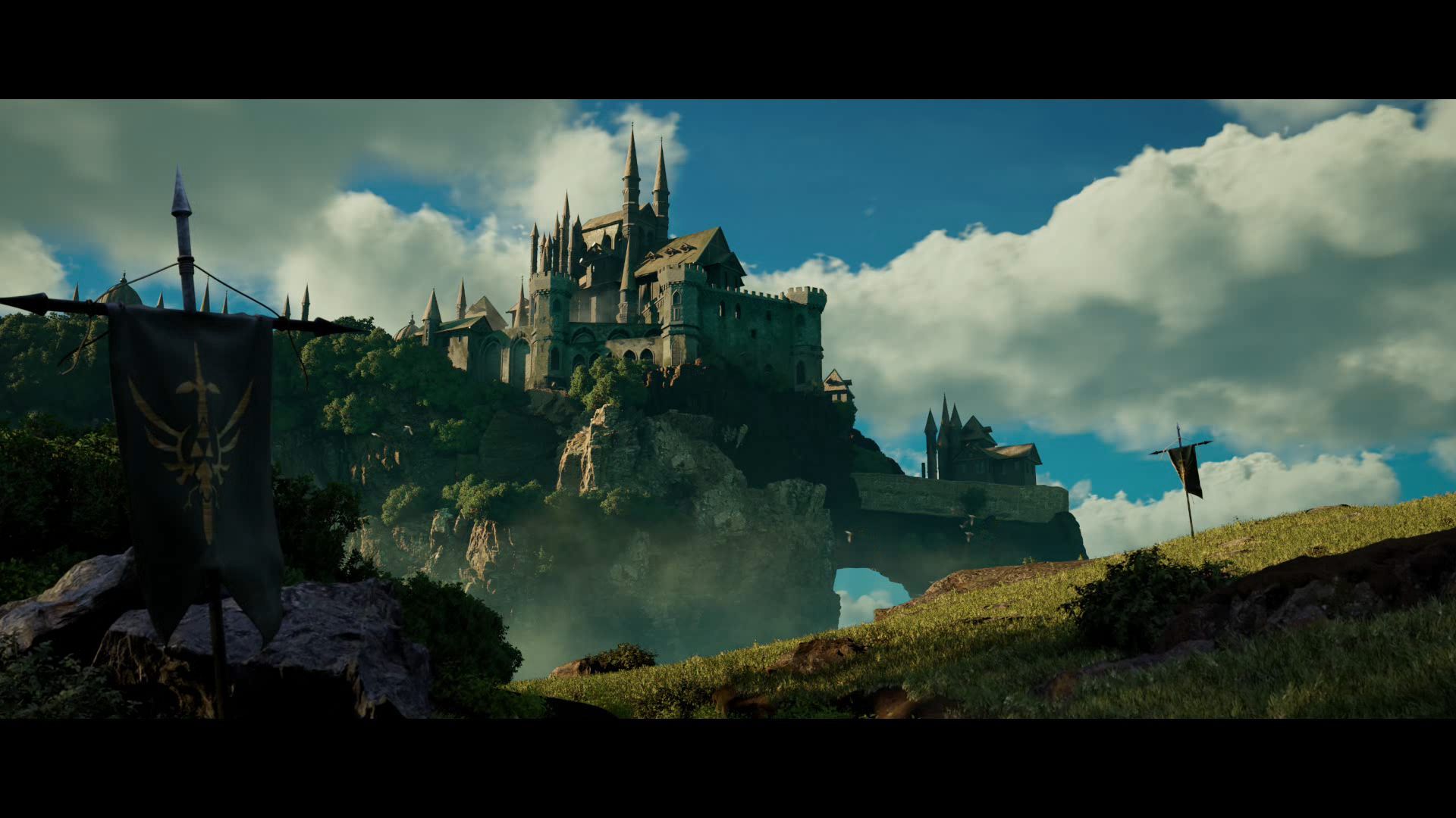
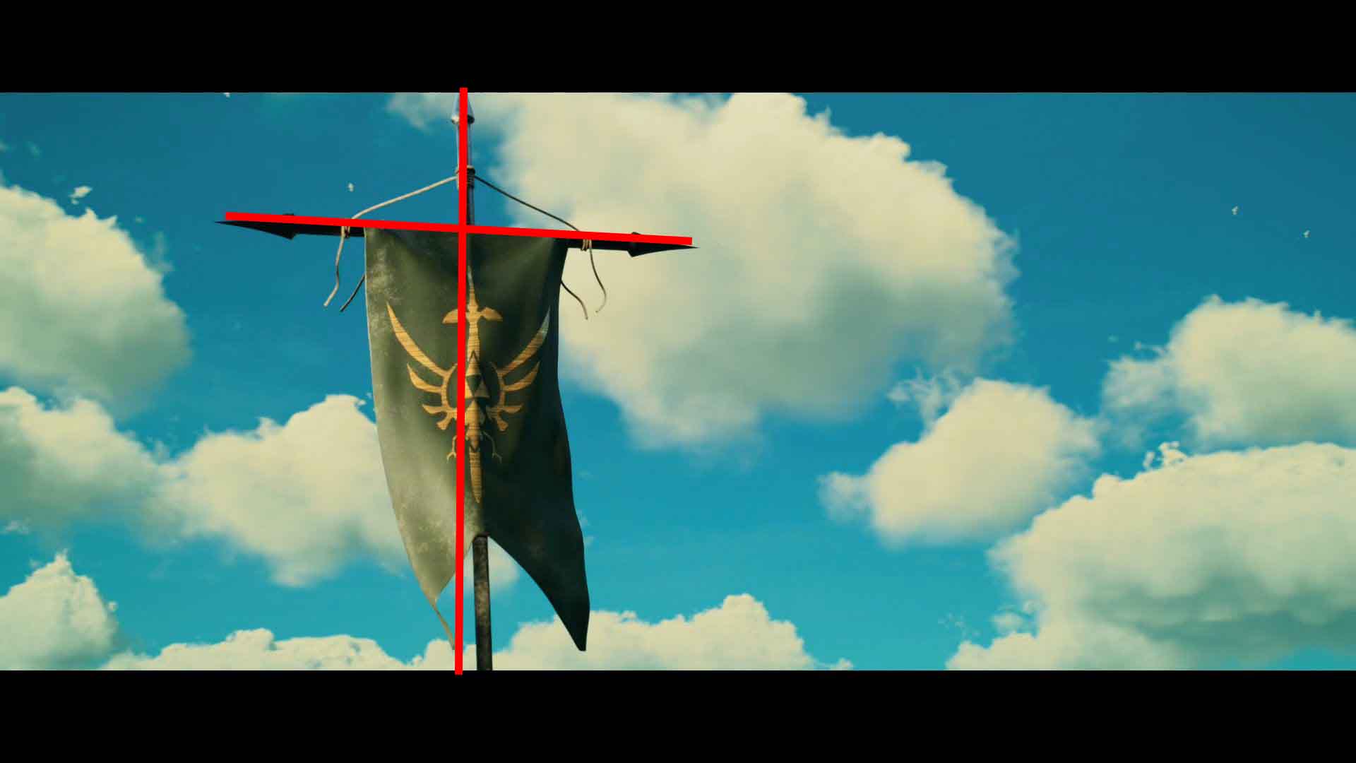
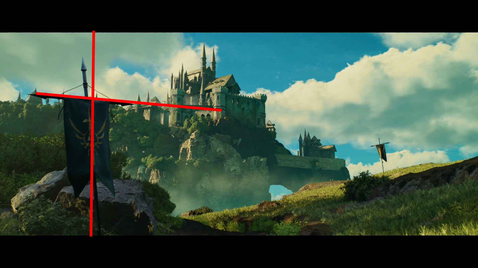
One more compositional consideration I'd like to discuss is the placement of the banners in the main shot. Initially, there was only the banner on the right. However, I decided to introduce another shot featuring the banner on the left side of the screen space. Nevertheless, the transition between the two shots drew the attention of one of my instructors, who emphasized the importance of compositional continuity between shots. As a result, I added another banner in the foreground, roughly mirroring the position of the banner in the first shot, to maintain the viewer's focus. Then, I utilized the composition of the second shot with the banners, arrows, rocks, etc., to guide the viewer's attention to the castle.
When it came to rendering I kept it rather simple. I rendered just a basic beauty pass, as well as Z-Depth and Cryptomattes (Object ID). I then brought the shots into Nuke and did some very basic compositing on them, before exporting them into Davinci Resolve where I did the final video editing.
Check out the final result here, and the original post in my Rookies profile here.
This was a really intense but also beautiful creative week. In the beginning I really hated the outcome and all its flaws (and believe me if you can’t see them right away, there are quite a few). But over time I started to appreciate how it turned out and especially all the things this project has taught me.
In addition to me pushing through the challenges, feedback was a very essential part of this project. There are a lot of creative and technical decisions I couldn't or wouldn’t have made without the help of all my colleagues and instructors along the way. I want to use this opportunity to thank all of you for your time and support, especially Fabrizio Meli, Robb Innes and Maksym Osmolovskyi.
Thanks a lot for taking the time and reading this article, and please feel free to reach out anytime via my Rookies profile.