How to Make a Creative Illustration for an Art Challenge
Nawel Benrhannou, an ISART Digital graduate and skilled Illustrator, shares insights on crafting a compelling illustrative piece for an art challenge. Seek inspiration for your Rookie Awards 2024 entry by reading on!
We asked Nawel Benrhannou, a graduate of ISART Digital and a talented Illustrator and Concept Artist, to share one of her student projects and provide insights into her considerations for creating a great illustrative piece for an art challenge. If you are looking for inspiration for your Rookie Awards 2024 entry, read on!
Origin of the project
Since the end of my studies, I've been on a mission to improve my portfolio at an industry-level abilities. That is why I seek new challenges to refine my skills and expand my creative horizons. One such endeavour was the "Golden ROI" contest, where artists were tasked with crafting a unique and original world that pushed the boundaries of imagination. It was a great opportunity to work on my storytelling and challenge myself with painting and environment, as I am not very used to it.
Now let’s talk about the process!
Brainstorming and Inspiration
For projects with a larger scope, it is quite important to gather solid references and organise them in a clear and efficient moodboard. It ensures that objectives are well-defined, providing a clear direction throughout the process.
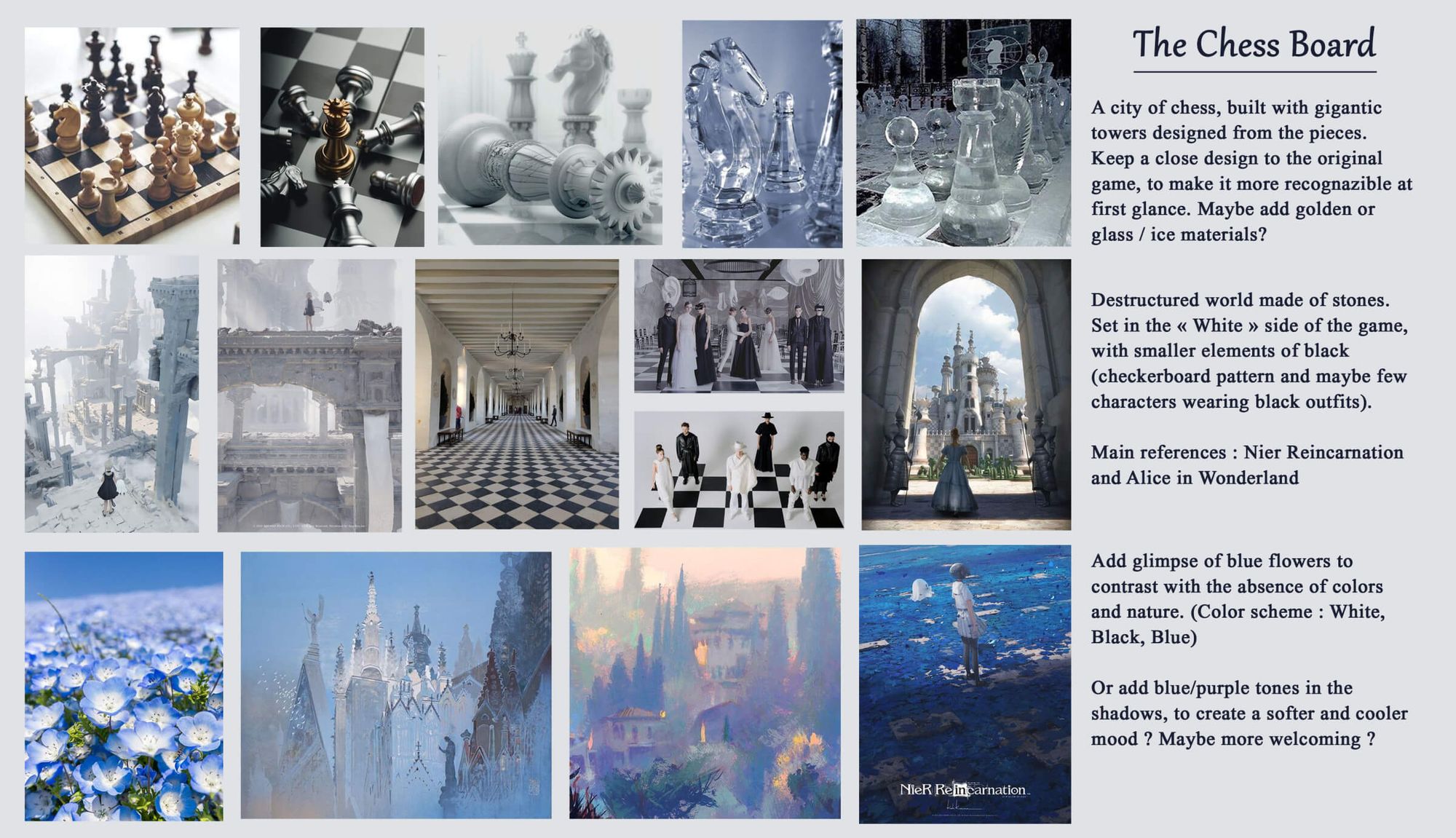
I started to think of what I wanted to tell and explore with this illustration, and I came across the idea of a giant chessboard game. I’ve always been interested in the object itself, which I found very pretty – some of them are literal works of art!
And while I found some references, such as “Alice in Wonderland” or “Harry Potter”, I noticed there weren't many examples of literal chess cities, so I thought it was an original subject to work on!
After clarifying my ideas, I made a brief moodboard and added some description and reflection.
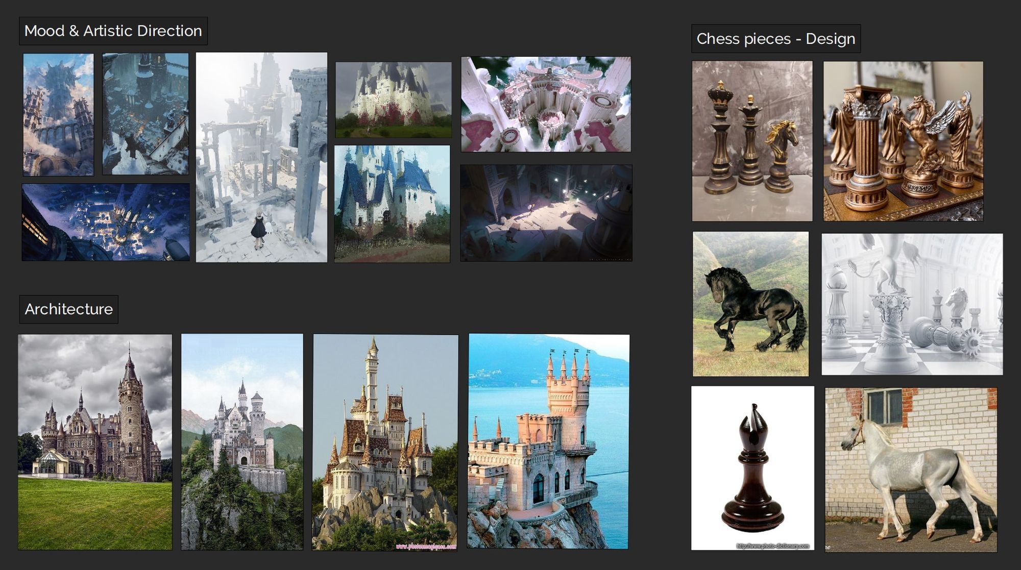
I also created a PureRef canvas, with extra references that would help me with designs and rendering techniques.
3D Blocking: Composition & Lighting
For most of my projects, I start to make sketches and research, to have a global vision of what I want to do. But this time, I went straight for a 3D blocking as I knew the piece would need a lot of details and a complex perspective. Although I am not a 3D artist, I do recognise its importance when it comes to respecting a deadline. Knowing some basics can save a huge amount of time, and it is a precious skill in any production.
Especially in that case, as I am not specialised in environment design, I knew that thinking in 3D would be a better approach. It was also a good opportunity to get back on Maya and improve my workflow in the software!
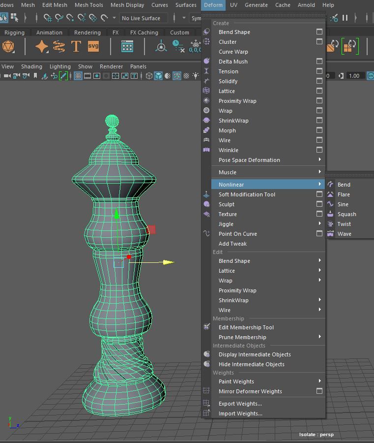
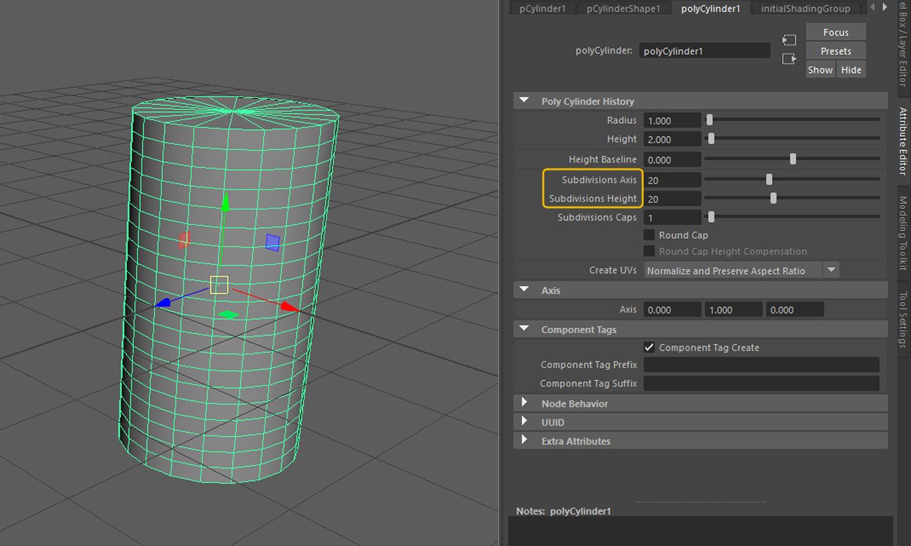
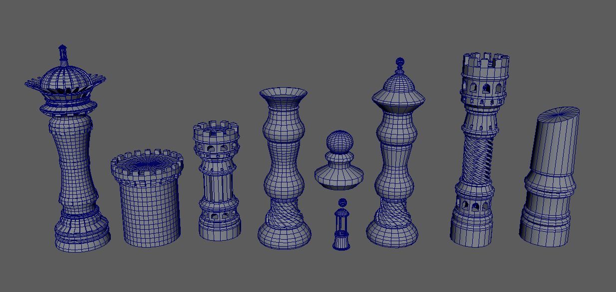
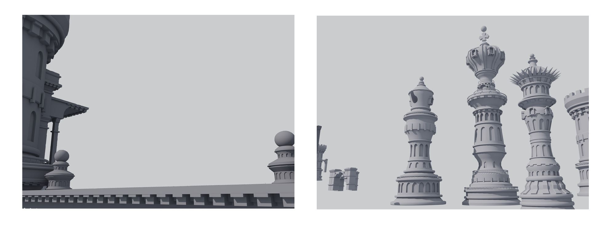
Before diving into the layout, I focused on the design of the pieces, as there were many ways to represent them. I used the basic shapes — the cylinder in particular, and created simple designs from one raw block. In this matter, one tool proved to be very efficient, the Nonlinear option in the Deform section.
It allows quick mesh modifications, especially when it comes to curves — Which can be tricky to make in 3D. So this was the perfect option for the designs I had in mind.
This blocking was not meant for game optimisation or UV’s unfolding. Make sure to have enough subdivisions on your polygon settings first, it will ensure a better deformation
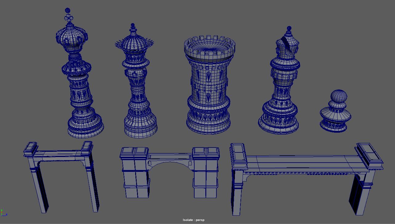
I came up with a rough base, for some of the pieces.
I kept the elements I liked, and finalised the designs, along with a few props that would enhance the image.
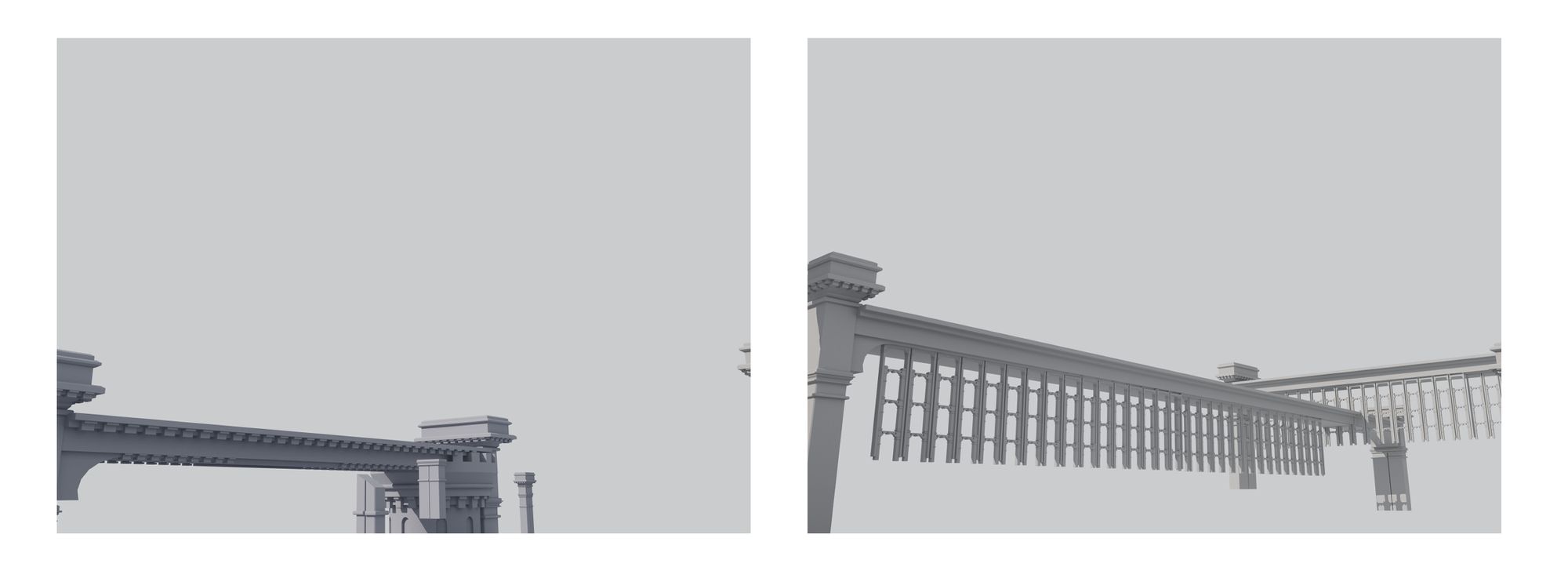
Then I started placing my blocks on my scene —A very satisfying part I must say, it’s like playing with Lego!
To make things easier, I set up a fixed camera as my render view. This way, I could keep an eye on the final shot while adjusting my blocks in the perspective panel.
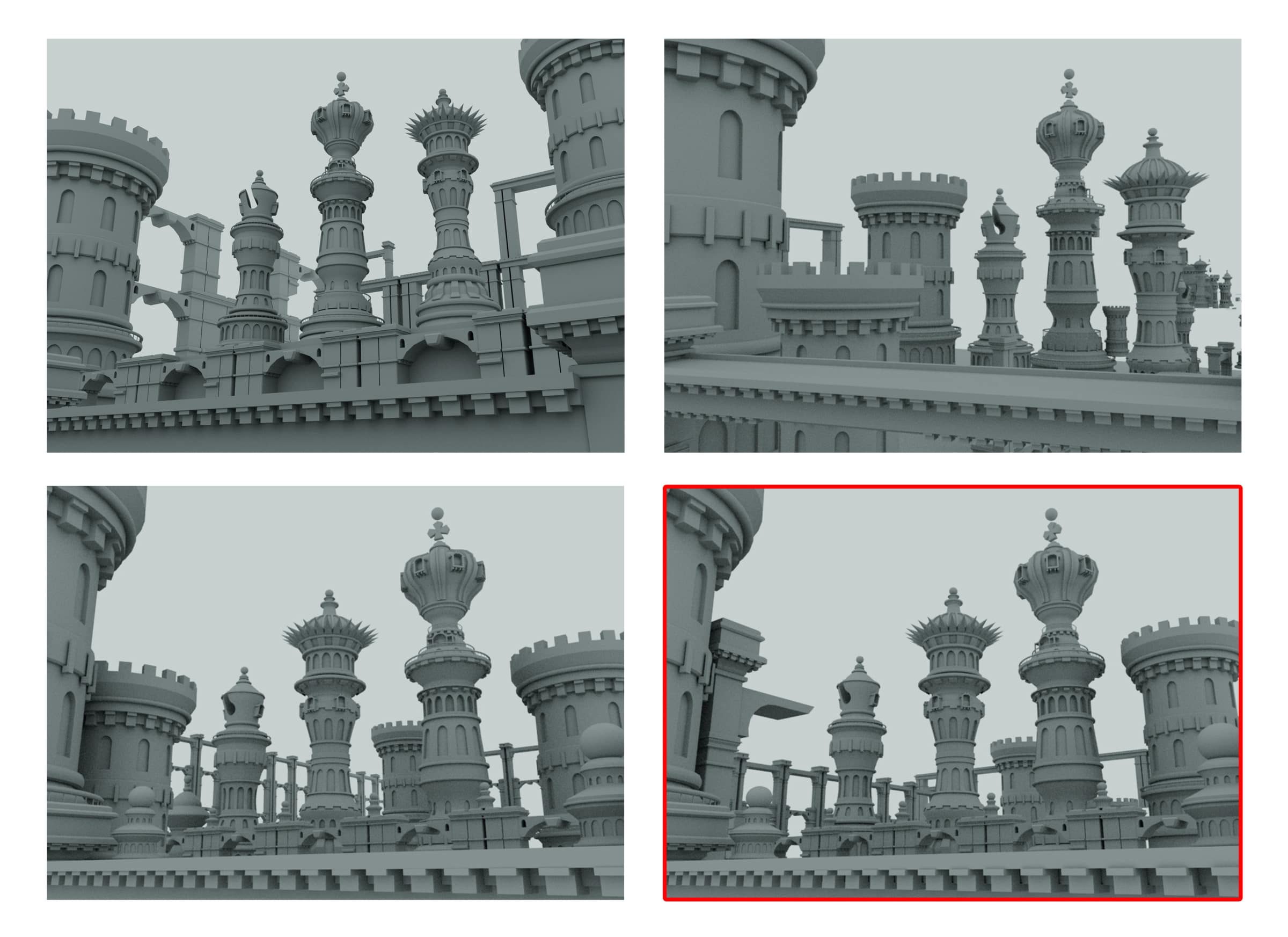
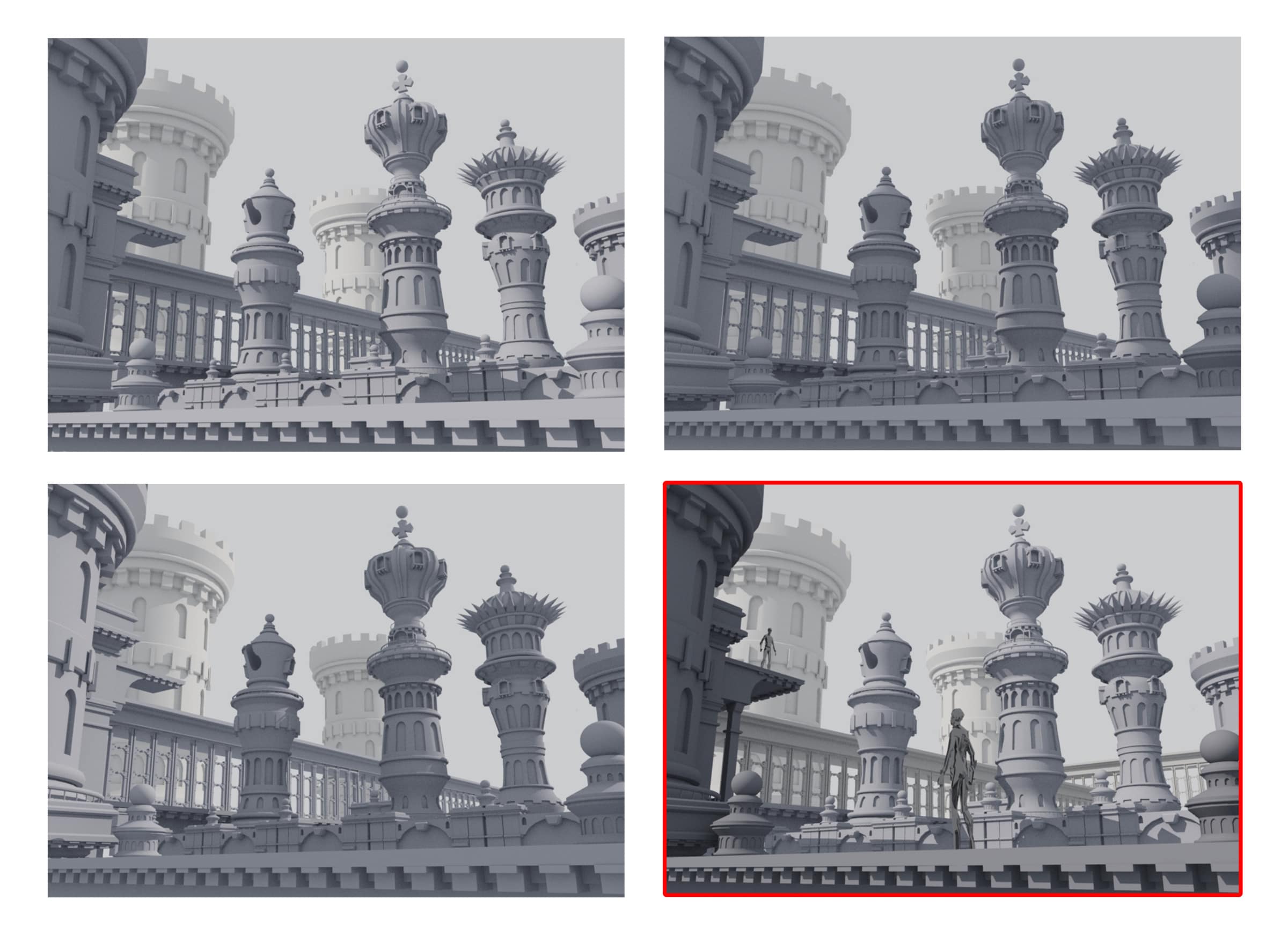
I finally came up with 4 propositions for my composition:
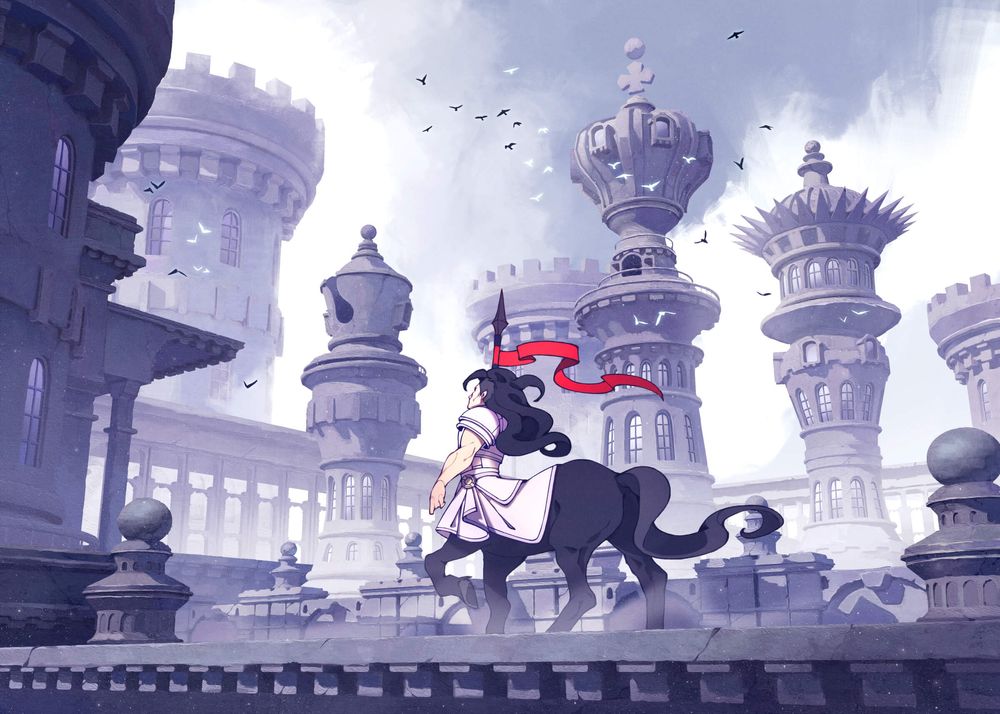
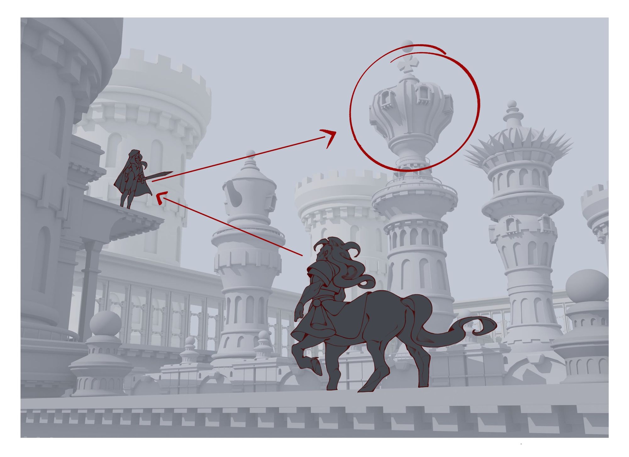
I chose the last one, to focus the attention on the towers —the king piece in particular, and evoke a feeling of gigantism.
Now it was time to think about the lighting, and how to make the image as legible as possible. It is one of the many advantages of working in 3D, having the possibility to move your light as you please!
On the fourth proposition, I directed the light to create cast shadows. Then I increased the dark and light tones, so I could play with atmospheric perspective later on.
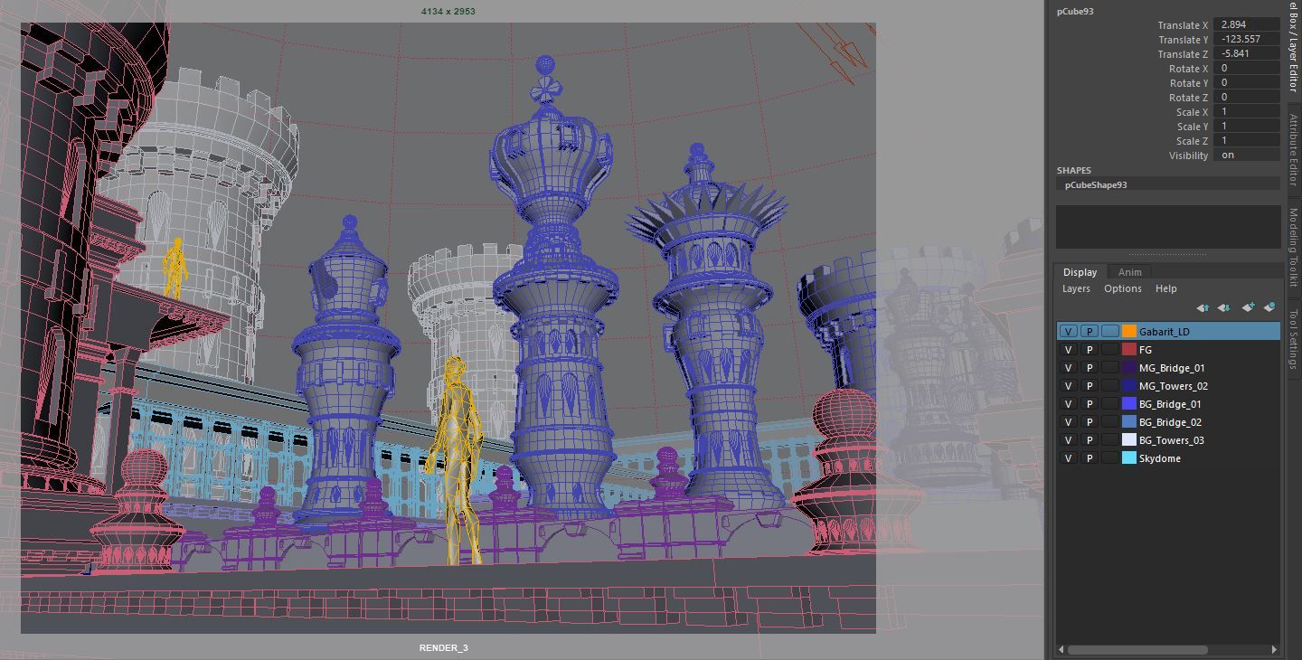
The blocking phase was now complete! I detailed my base as much as I could, because the more I did in 3D, the less I would have to rework in my paintover.
Paint Over
At that stage, it was important to remind me that my final work was a 2D illustration. Although the 3D blocking helped me in a lot of ways, a large part of my work was yet to come, along with its issues. What if I wanted to change the layout? What if I wanted to remove an element, or rescale it?
I wasn’t going to re-export my scene every time I needed to change something. So, in this endeavour to save time, I anticipated those questions and saw my scene as a group of layers, exactly like a parallax for 2D games.
Once I had the final version of my render view, I created those layers on Maya, along with a proper nomenclature.
Now I could export my scene with as many plans as I wanted, instead of one raw image. Thus, I wouldn’t have to separate my layers in my PSD file or worry about making adjustments.
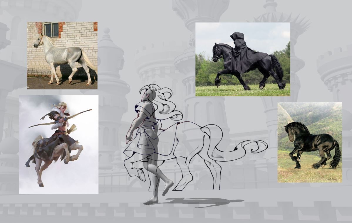
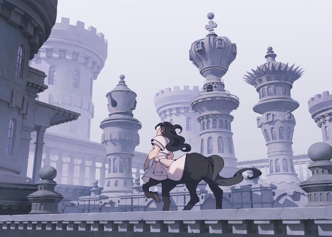
My file was now ready! But before painting anything, I focused on the design of the Knight, as it was the only missing chess piece. I had already planned to make a “human” version of him, because I thought it would bring more life to the image.
First, I searched for extra references I could use for anatomy studies and design inspiration. Then I started thinking about making him fit the actual perspective. Indeed, my point of view was rather complex, as I placed the camera in a low-angle shot. And even though I am more comfortable with drawing characters, it was still a complicated posing.
So once again, I used a 3D base from the 3D assets library of Clip Studio Paint, which has the great advantage of being rigged!
I placed the model in the correct perspective, and I could start sketching above.
At the beginning of the project, I also planned to add a second character to the scene, to emphasise the focus on the king’s tower. But as the painting went on, I felt it didn’t fit quite right in the global image. so I chose only to keep the knight, and focus my rendering on the contrast between him and the towers.
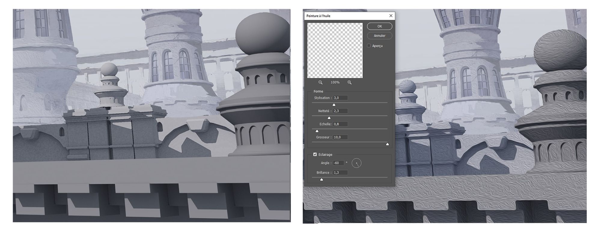
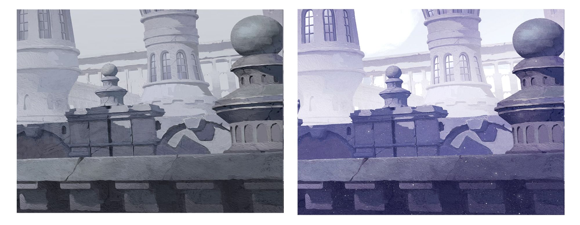
The painting stage could finally start! I struggled a bit to break the “3D” aspect, mostly because I wanted to keep the roughness and simplicity of the stone. So, to create a painterly effect, I used an oil filter in Photoshop as a rough base, so it could give me some matter to work with.
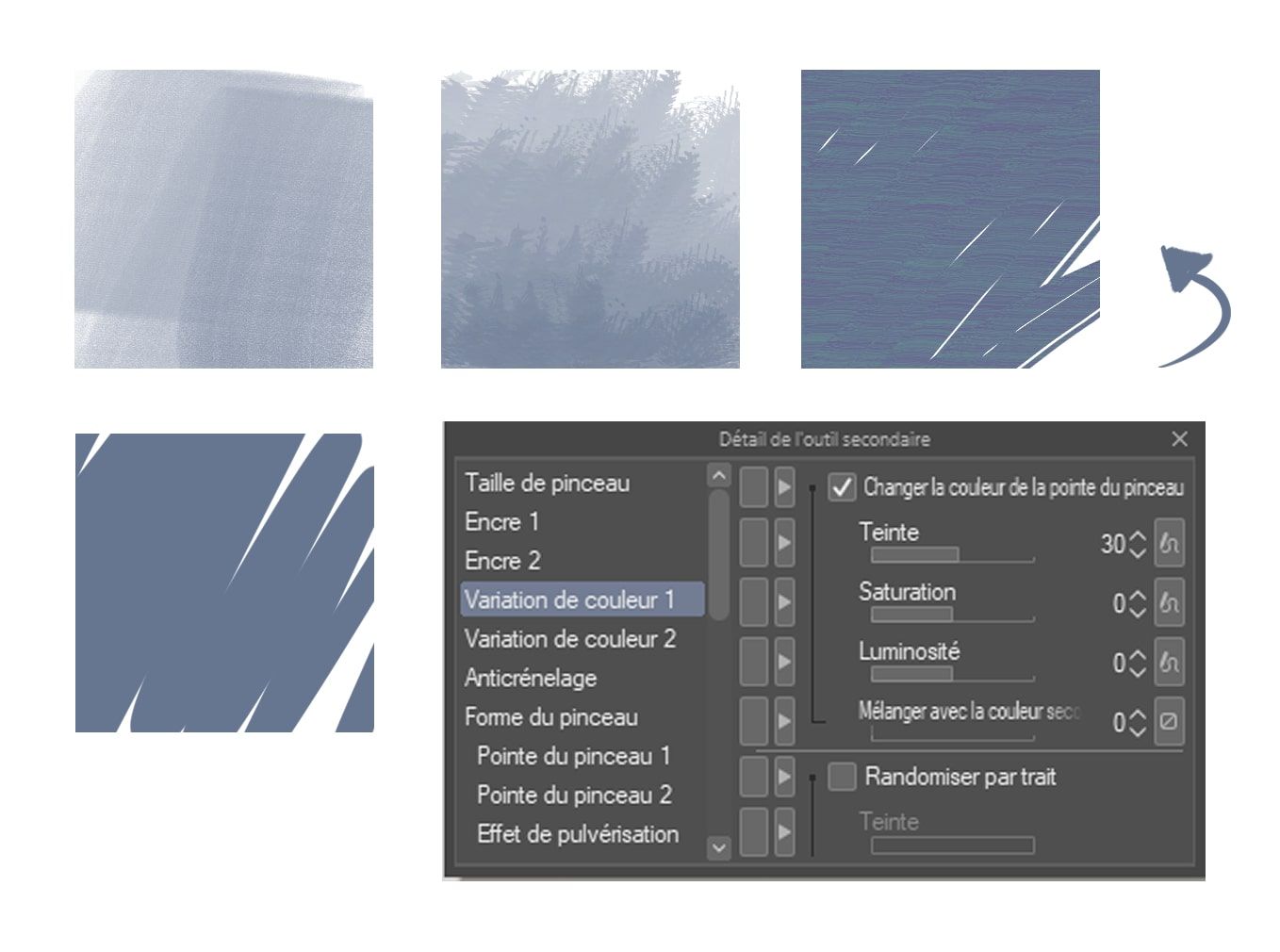
Then I used textured brushes (the flaptraps brushes from Richard Anderson) and modified a bit the settings of one brush. I activated the colour variation and increased the hue to 30, so it generates several layers of colours.
This was done in Clip Studio Paint, but the same option exists in Photoshop.
I started painting, and gave large brushstrokes on my canvas to break the perfect and smooth rendering of the 3D. I also made the shadows less accurate, so it would emphasise a more hand-drawn impression. I finally added some filters and effects to homogenise the whole.
As for my character, I drew him with lines and flat colours. I thought it would give an interesting balance between the painted background and this «line-art» rendering.
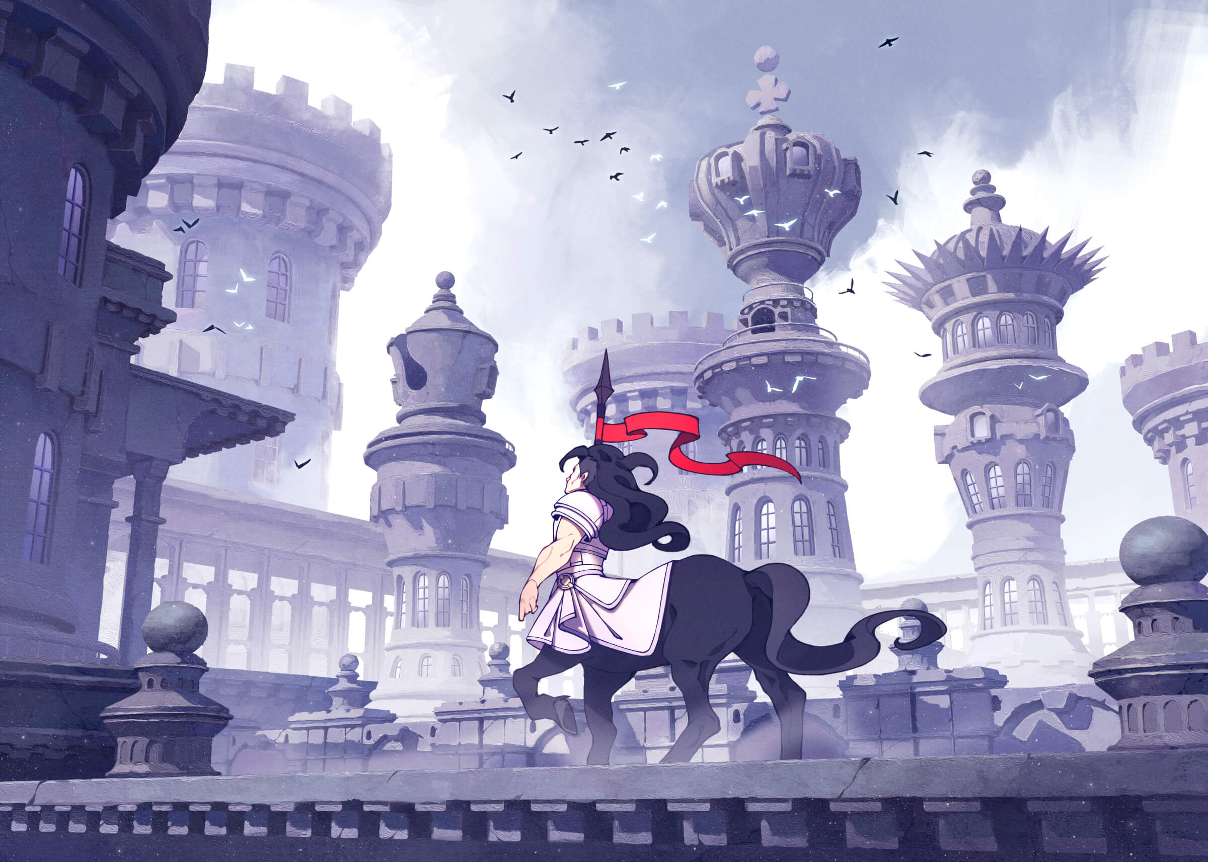
The painting came to an end. I added some final touches, to emphasise once more the contrast between the character and the background. And there it is, the final version!
Conclusion: Motivation & Feedback
I’ll conclude by saying that jumping into an ambitious project can be tough when we’re on our own. Constantly doubting our decisions can sap our motivation.
That is why the context of a competition is a great driving force, it helps to have a purpose, a goal we want to achieve. Having a deadline and a theme to respect is also an important aspect, especially if we’re aiming for a professional career!
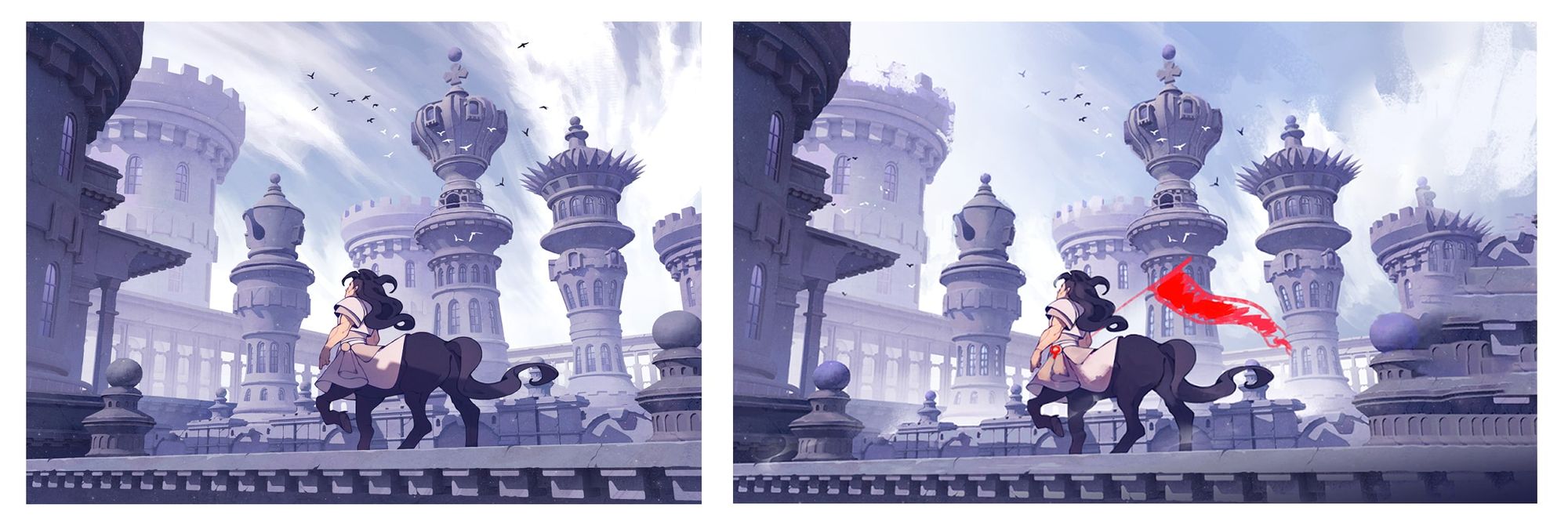
And it is, at last, a good opportunity to ask for feedback, I sure did along the process! Being open to advice, whether from a group of friends, or a discord community can ensure a better mindset, as teamwork is a crucial skill in the industry.
The terms of this contest were a bit particular, because we weren’t allowed to show any of our work in progress on our social media. But I am lucky enough to have a close group of professional artist friends I can turn to for advice.
Two of them, (Florent Boston and Léa Lebourgeois) are Environment Concept Artists and illustrators. So naturally, they have a better understanding of what works and what doesn't in this kind of project.
For example, it is Florent who advised me on the composition and told me how I could make my towers more impressive. And it is Léa who helped me with the final mood and suggested this strong touch of colour.
Léa's paintover on the right
Léa also suggested a wider composition to reinforce the epicness of the scene. But the dimensions were already predefined as a rule of the contest, so I couldn’t change it.
But although I tend to trust my mates, it is also important to consider our personal tastes. Taking some advice is great, having too many can be confusing, and we can easily get lost in our decision-making.
It is a matter of finding the right balance between what we want to do, and what is objectively a better direction. And the best way to spot the difference is to get used to it!
Thank you if you read this far, hoping you’ve learned a thing or two. I wish you the best in your artistic journey!